Services
Brand Identity Design
- Brand Logo design
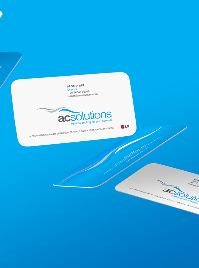
- Brand Stationary design
- Rebranding
AC Solutions is one of LG India's top 50 dealers, specializing in Commercial Air Conditioning solutions for industries, retail spaces, and corporates for over a decade.
Their mission is to provide reliable cooling solutions, ensuring that businesses can operate efficiently without the discomfort of inadequate cooling.
_3.jpg)
The Deal
Craft a corporate brand logo and identity for AC Solutions, reflecting their evolution and expertise in the commercial air conditioning sector.
Design cohesive and impactful stationery that aligns with the new brand identity.
Rebrand the overall visual identity to convey cooling, expansion, and solutions.
Develop a tagline that encapsulates the essence of AC Solutions' services.
_1.jpg)
The Dope* Process
Reimagining the AC Solutions Brand Identity
The client had evolved significantly from the days of their original brand logo, which featured a window air conditioner unit.
I know, I designed it back then too. No judgment – we all start somewhere.
They wanted the new logo to reflect cooling, expansion, and solutions.
Target Audience and Design Approach
Understanding that our target audience comprised key decision-makers in industries and corporations, we opted for a minimalist design with a corporate color palette of cooling blue and grey.
This palette not only symbolized professionalism but also the cool, refreshing nature of their services.
Because let's be honest, nobody likes to work when the weather is slow-frying your brain.
_1.jpg)
Concept Development: Cool Air in Motion for AC Solutions
The brand provides professional, innovative cooling solutions to large-scale corporate and industrial spaces, solving existing air system issues.
Given their name, we focused on air, its motion, and, of course, its coolness. Pun intended.
This approach also allowed us to future-proof the brand for expansion into other air conditioning segments, rather than restricting it as the previous logo did.
Design Execution: The Wave Effect in AC Solutions' Logo
We designed three air waves flowing downward, representing the motion of cool air, which is heavier than warm air.
Each wave was colored to signify different temperatures and air quality: grey for warm air, greyish-blue for changing temperature, and cool blue for clear, cool air. These waves were aligned above the sans-serif typeface, settling just above 'solutions.'
Typography and Color Scheme for AC Solutions
We used two fonts: bold for 'ac' and light for 'solutions,' coloring them grey and cool blue, respectively. This color and font combination visually connected the logotype with the logomark, highlighting what each part of the name represents and unifying them as a whole.
Simply put, when warm air meets AC Solutions, it cools down. When an air conditioning system has issues, AC Solutions resolves them.
_1.jpg)
Developing the Tagline: Reliable Cooling for Your Comfort
To amplify the message, we coined the tagline, "Reliable cooling for your comfort." In a highly disorganized sector, this tagline emphasizes the firm's reputation for reliability and consistent solutions.
So there you have it, a brand identity that’s just as cool and reliable as the solutions it represents. Now you’ve got to admit, that’s some seriously cool dope!
_3.jpg)
The Dope* Impact
Rebranding AC Solutions resulted in a fresh, modern identity that stands out in the competitive commercial air conditioning market.
The new visual identity has significantly improved brand recognition and client engagement, showcasing the company’s dedication to innovative and reliable cooling solutions.


