
Services
Brand Identity Design
- Brand Logo & Identity Design
- Corporate Brochure
- Responsive Website Design
dwp interics is a well-established name in India’s architecture and interior design space, trusted by more than 700 corporate brands including several Fortune 500 companies.
With a legacy built over decades, the firm has shaped workspaces across the country with clarity, precision and a strong design philosophy.
Despite this strong presence, their earlier brand website did not fully reflect the scale, credibility and leadership position the company held in the industry.
The Deal
Build a clean, minimalist brand identity that reflects the company’s values and vision
Create a website that presents dwp interics with confidence, clarity and ease of use
Strengthen consistency across touchpoints and establish a scalable identity system
The Dope* Process
Discovering the dwp interics Story
Our early conversations focused on understanding the firm’s roots, the founders’ values and the design philosophy that shaped the brand since 1984.
It quickly became clear that refreshing the identity before updating the website would bring more clarity and structure to all future communication.
This approach gave the company a stronger foundation and ensured the website reflected the brand accurately.
Exploring dwp interics's Brand Roots
dwp interics was born from the global design legacy of its parent brand dwp, adapted to the Indian market by its co-founders.
Built on principles of minimalism and functional design, the brand had a clear design language from the start.
The tagline “design with passion” emerged early and resonated strongly with the founders, capturing both their ethos and their belief in purposeful design.
Understanding the Global Landscape
To anchor the identity in a modern context, we studied the visual presence of leading global brands in the design and architecture space.
Combined with insights from dwp interics’ leadership, their teams across multiple offices and their client expectations, this helped shape the early direction for the identity.
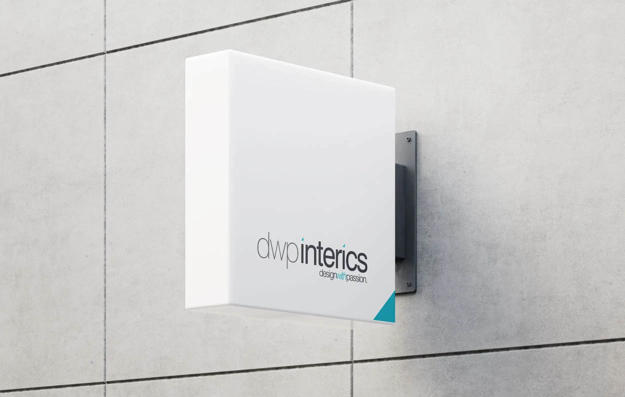
Crafting dwp interics' Minimalist Visual Identity
dwp interics’ architectural and interior design work was the hero.
Their portfolio spoke for itself, so the brand identity needed to remain understated, confident and corporate in tone, without competing with the visuals of the work itself.
A minimalist typeface formed the base of the identity. Two styles were used to create a balanced logo that was strong, simple and timeless.
The Meaning of the Triangle
To differentiate the typography and create a distinct identity, the circles above the letter “i” were replaced with triangles.
The triangle carries meaning tied to architecture, balance, direction and foundational structure. Its a subtle nod to the firm’s roots in design thinking.
This shape later became the foundation for the 3D compass evolution seen in the 2025 refinement.
Embracing Color and Symbolism
A restrained palette of white and stone grey gave the brand a professional and balanced feel.
A single accent of turquoise added freshness and energy without overwhelming the minimalist system.
Each office was represented by a different coloured triangle, creating unity across locations while giving each team its own simple identifier.
A Scalable Visual Identity
The updated identity carried forward seamlessly across stationery, signage, presentations and all corporate communication.
Professional project photography further elevated the brand by showing the scale and quality of the work.
Enhancing Project Visibility on the Website
The website was designed to allow users to access projects easily, filter by client or location and navigate with clarity.
The goal was to make the portfolio feel structured, informative and easy to explore.
A Clear and Engaging Website Experience
The site served as a central place for existing and potential clients to understand the brand’s principles, see the depth of their work and get in touch effortlessly.
Videos, imagery and simple animated typography brought the identity to life without overwhelming the user.
The Dope* Impact
Increased Brand Cohesion
With a unified brand visual identity and messaging strategy, dwp interics achieved greater brand consistency across all touchpoints, reinforcing its positioning and values in the minds of customers.
Stronger Brand Perception
The refreshed identity aligned with the firm’s values and aspirations, helping clients see dwp interics with renewed clarity and confidence.
Long-Term Recognition
The identity system remained relevant for more than 15 years, supporting the brand through growth, talent attraction and global visibility.
Explore the 2025 Identity Refinement & Website Redesign →
The Dope* Experience
Happy Founders

Raju Chacko Philip
Dwp Interics Pvt. Ltd.
Founder, Entrepreneur
His creative expertise and unique design solutions as visible on our website is the reason I have retained him as our brand design consultant for the last 15+ years.
"Rajesh came in to redesign our brand logo and identity and create a minimalist website that matched our ethos.
I have a high regard for him professionally as well as personally and would highly recommend him to those who understand the importance of creative and strategic design solutions when it comes to brand logo and identity creation."