
Services
Brand Identity Design
- Brand Logo
- Brand Stationary
- Brand Style Guidlines
- Brand Product Packaging
- Brand Promotion Graphics
- Brand Website
Creating a Flavored Nuts – Seeds – Trail Mixes category in the competitive Indian FMCG market wasn't merely a challenge; it was an opportunity to redefine snacking for millennials, young professionals, moms, and kids.
Enter Bazana! Healthy Roasted Snacks - a snack on the go, subtly promoting health and flavor in 15g packs.
The Deal
Design a kick-ass brand package for healthy snacking —adults and kids, bite-sized.
Design the brand logo strategically on small packs for max visibility.
Infuse the energetic 'buzz-aa-na' into the brand visual identity for high recall aross touchpoints.
Choose vibrant colors reflecting mass appeal and Bazana!'s flavors.
No pre-launch ads in Phase I. Let the package dance the talk with distributors and customers, saying, "I'm the snack you've been waiting for. Open me."
The High

Recognized as one of The Best Snack Packaging Designs 2023 by DesignRush.
Recognized as one of the Best Rated Snack Packaging Designs by Packaging of the World.
The Dope* Process
The journey began with coining the brand name – Bazana!
The brainchild of its Co-founder and Brand Strategist, Justin Ancheta he provided crucial market research and insights that was a godsend while conceptualising the brand's visual identity.
The tone was set very early in our discussions with Justin saying, “Let's build something Dope* together!”
Diving into ground market research, I absorbed insights from 'Brand Seduction' by Daryl Weber and podcasts by Chris Do of thefutur. Trips to kirana stores for hands-on analysis of existing dry fruit brands, coupled with online exploration, fueled my design inspiration.
I xeroxed the pack dieline (KLD) multiple times, using it as a framework to sketch brand logo ideas.
The aim?
A distinct, visible brand within the visual constraints of pack dimensions.
Energizing the Name
The pronunciation, 'buzz-aa-na' became my source of inspiration, a call for 'bring me the energy!' in Hinglish.
Hence, the spirited '!' was strategically added to Bazana! - a symbol not just for our brand personality but also set a visual and emotional tone, harmonizing with the creative brief and setting the stage for a vibrant visual identity that truly pops.
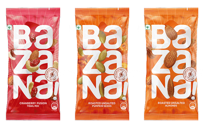
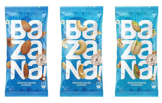
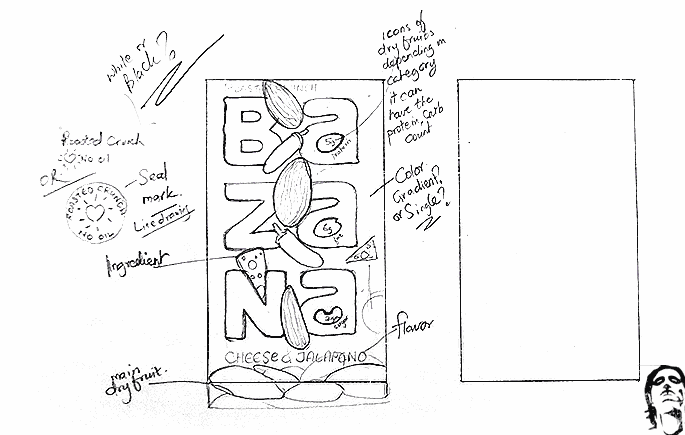
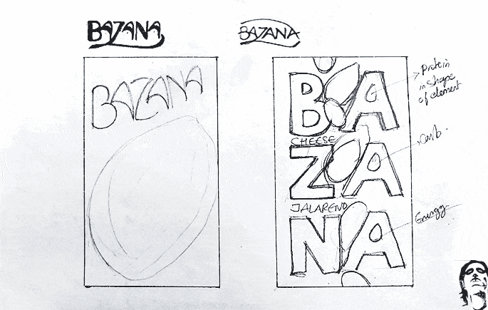
Logo Tetris: Crafting Bazana!'s strategically playful Logo
Opting for a horizontal logo on a 15g pack? That's like playing hide and seek on a grocery shelf – not a winning strategy!
Taking a strategically playful approach with the name, I crafted the logo typography vertically like a game of Tetris.
Two letters each of Ba / za / na! were sketched in three levels, ensuring maximum visibility on small packs on crowded shelves.
This text placement also made readability easy for all ages.
Packaging dynamics: Motion-fueled design for irresistible appeal
The packaging design became a canvas for motion, showcasing ingredients in a unique, non-traditional way.
Dry fruits strategically placed around the logo created a dynamic movement, with the hero ingredient at the center, enhancing visual appeal.
And guess what? The design language even transformed bland brown delivery boxes into Bazana! wonders.
Collaboration with photographer Namrata Mesharam brought our heroes - dry fruits to life.
Macro lens photography captured the essence of each dry fruit, injecting visual energy into the packaging.
Color Palette Explosion: Energizing Packs with Vibrant Indian Hues
Inspired by vibrant Indian culture and yes - M&M's, each pack featured colorful Pantone shades representing flavors.
Blues for Roasted, Orange for unsalted, Red for Cranberry fusion and more—a burst of color symbolizing energy and emotion in each pack.
Color = energy. Energy = emotion.
Color is also an Emotion!
The Dope* Experience
A visual delight across touchpoints with high recall value.
Debuting a brand in the chaotic FMCG jungle of one of the planet's most cutthroat markets, in the most densely populated country, is no walk in the park.
So, imagine the game-changer when distributors ring you back, and doors swing open for sales.
Now, that's a visual victory validation :)
Business Card Personality: A Pocket-Sized Burst of Bazana! Energy
The vertical business card became a vibrant, pocket-sized Bazana! pack, mirroring the design with color backgrounds reflecting emotions.
Red for passion (Founders), Blue for calmness (sales), Green for money (accounts), and more.
The ingredient? The essence of the role is whose card it is!
Brand Guidelines: Crafting consistency in brand collaborations
A comprehensive brand guidelines manual was crafted to ensure consistency across collaborations.
Custom-designed iconography, brand typefaces, color codes, and more were detailed, providing a roadmap for anyone contributing to the Bazana! Brand.
This helped provide the client with the ability to launch new flavors and social media teams to drive visually consistent messaging.
Digital Presence unleashed: Responsive website and promotional graphics expanding Bazana!'s reach.
A vibrant, responsive website was designed to narrate Bazana!'s story, showcasing its profile, vision, founders, products, and where to buy.
Simultaneously, promotional graphics were created to support the launch of e-commerce stores on Amazon and Flipkart, expanding Bazana!'s reach to online audiences.
Promotional graphics galore: Seamlessly integrating brand in every detail
From sales brochures to PPT templates, dispenser boxes to retail stickers, a myriad of promotional graphics were created for the sales team.
Each piece seamlessly integrated with the brand, supporting both the marketing and sales teams on the ground.
The Dope* Impact
Strategic Launch: Slaying without print ad fuss
Bazana! sidestepped conventional advertising like hoardings, banners, newspapers, and magazines, relying solely on the success of its brand packaging design to charm its way into well-known distribution channels.
Result? It launched in over 12,000 stores across Pune, Mumbai, and Bangalore, creating a buzz without traditional media promotion.
Distributor Delight: Surprising Success in the First 20 Days
Expecting a slow distributor uptake, Bazana! surprised everyone by securing 10 distributors within the first 20 days.
The unique packaging garnered attention, admiration, and callbacks, making it a sought-after brand for distribution channels.
Consumer Connection: Tangible vibrancy beyond shelves
The packaging resonated with consumers, going beyond distributors.
A city manager in Bangalore, awed by the packaging during an interview in Mumbai, found it to be a tangible representation of Bazana!'s vibrancy.
Fun messages from consumers saying,
'Hey, I got to eat Bazana! Snacks at our office' or 'I saw it in the store near my home – you designed it?'
or happy moms sharing that their children asked to pack that colorful snack in their lunch boxes sealed the deal!
Happy Founders

Justin Ancheta
Bazana! Healthy Snacks
Co-Founder, Entrepreneur
With Rajesh we weren't just paying for design, we paid for over 15 years of deep expertise and this created a huge shortcut for us. By getting it right the first time, we avoided the need for costly redesigns, saving us an additional $30,000!
"Working with Rajesh was a game-changer for Bazana! We assumed breaking into the market and finding good distributors would be an uphill battle for six months to a year, costing us around $100,000 in sales and marketing expenses.
Instead, within one month, 15-20 top distributors in Mumbai were calling us because of our unique and compelling design for a dry fruit brand. This rapid traction let our sales team focus on driving more sales instead of chasing distributors attention.
When you're recruiting 30-40 sales and marketing people, it costs time and money, and the level of talent you attract is somewhat proportional to how awesome your branding looks. Our new brand identity was so compelling that people wanted to be part of our team because of how exceptional it looked.
Artisticodopeo Designz didn’t just give us a brand; he gave us a powerful tool that significantly reduced costs, boosted profitability, and made Bazana a highly attractive workplace. It’s been one of our best business decisions, positioning us strongly for future growth.
We are extraordinarily proud of the brand that has been created in partnership with him."