Services
Brand Identity Design
- Brand Logo Redesign
- Brand Identity Redesign
- Product Label Redesign
Seventh Pathy specializes in proprietary herbal tinctures, aiming to unlock nature's potent healing properties. Our mission is to rejuvenate the heart, calm the mind, and elevate the body through holistic purification.
Led by Founder Paul Dang, with over 60 years of experience, Seventh Pathy (or 7thPathy in its previous form) embarked on a transformative journey. Originating from a successful venture in India, the brand now targets the vibrant U.S. market.
Understanding the importance of blending ancient traditions with modern wellness, Seventh Pathy, in partnership with Brand Strategist Justin Ancheta, recognized the necessity for a rebrand before its U.S. launch.
Enter Artisticodopeo.
.jpg)
The Deal
Redesign the outdated brand visual identity to establish credibility and reliability in the competitive nutrition product market.
Transform the brand logo for adaptability, readability, and enhanced visibility across various platforms.
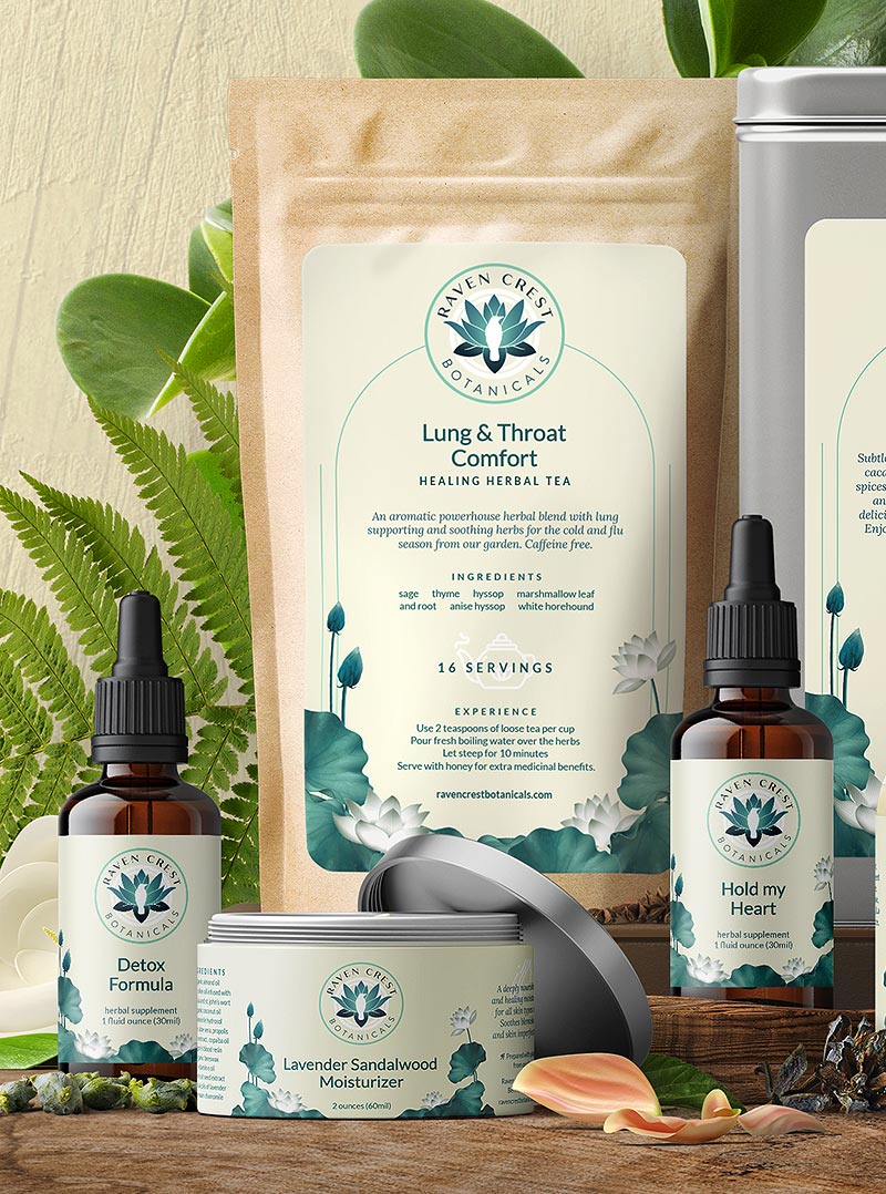
The package redesign needs to convey assertiveness, clinical confidence, and nature minus the traditional earthy aesthetic.
Redesign of product labels for optimal visual hierarchy and readability.
.jpg)
.jpg)
The Dope* Process
Discovery Calls and Briefings
Our journey began with discovery calls and briefings into crucial aspects of the brand, covering its vision, positioning, target market, competitor analysis with Brand Strategist, Justin, and visual design preferences.
Client's Vision and Vibes
Seventh Pathy had a crystal-clear vision—crafting vibes that are clean, compassionate, and assertively awesome.
No clichés here; we set out to break the mold of earthy, rustic product lines and create a visual language that's as unique as the brand itself.
Inspired in India. Made in U.S.A
_1.jpg)
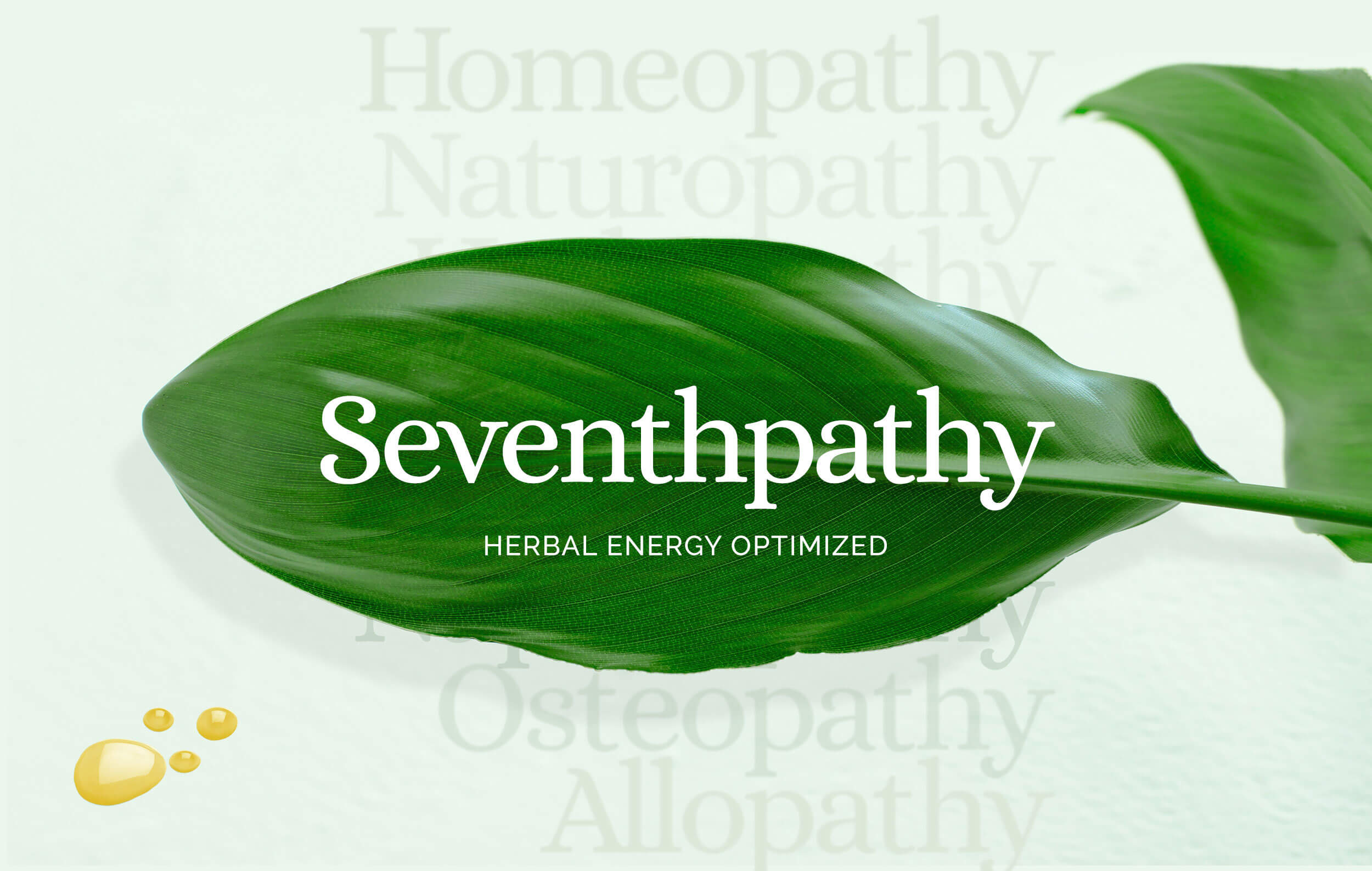
60 Year Philosophy behind new tagline
Named Seventh Pathy to align with esteemed treatments like Naturopathy, Homeopathy, Allopathy, Osteopathy, Hydropathy, and Naphrapathy, the brand's essence was beautifully articulated by Justin:
"A 60-year journey has led Paul to understand the deep nuances of each herb, hand-selected from the farm. Each plant carries its own energy signature or elixir, crafted into a holistic remedy targeted at the entire body system."
Herbal Energy Optimised - a reflection of this philosophy, now encapsulated in its new tagline.
Discovering Seventh Pathy: Beyond the Logo, It's a Branding Vibe
Seventh Pathy's rebranding journey unveils more than just a logo, it's a vibe, a story, and a salute to the brand's core beliefs.
Picture this: a herb leaf symbolizing 'nature,' its signature elixir drop buzzing with energy, and sunlight throwing life-force confetti.
Harmoniously converging, they give birth to the iconic number 7- our unique brand logomark.
Font evolution: from 7th to Seventh Pathy
Our serif logo typeface takes a nostalgic journey, reminiscent of vintage bottle labels resonating with the natural remedies' essence.
A modern touch emerges as the brand gracefully transitions from 7th Pathy to Seventh Pathy.
The elixir droplet icon, strategically nestled between 'n' and 'h,' unifies the words, striking a balance between individuality and cohesion.
Now our new brand logo serves as the cornerstone of our vibrant stationery design, seamlessly incorporated into business cards, letterheads, and envelopes.
This evolution encapsulates the brand's journey into a refined dope* AF visual identity.
_1.jpg)
Tagline tango: Sun-Circle or Line Charm
The tagline, 'Herbal Energy Optimised,' was crafted for adaptability.
It unfolds in two forms - a circle representing the sun, harmoniously adaptable to both the logomark and logotype.
Alternatively, it can transform into a sleek line or a 3-line box when space is at a premium.
Welcome to the era of responsive, versatile logos!
.jpg)
.jpg)
Packaging Poetry: Where design meets essence
This design journey extends beyond the logo, embracing Seventh Pathy's products.
Plants and their elixir steal the spotlight on packaging labels and boxes, not just to flaunt, but to establish that unbreakable visual link to the logo, even on smaller labels.
Because in the world of Seventh Pathy, size does(n't) matter.
_1.jpg)
Color Palette: A Symphony of Nature's Hues
Inspired by the vibrant colors of plants, flowers, and herbs, Seventh Pathy's palette dances against a predominantly white background.
This intentional choice symbolizes the synergy between health and nature, differentiating products while staying true to the brand's theme and brief.
In every hue, the essence of Seventh Pathy blooms.
_1.jpg)
Brand Guidelines: Crafting consistency in brand collaborations
A comprehensive brand guidelines manual was crafted to ensure consistency across touchpoints.
Brand typefaces, color codes, and more were detailed, providing a roadmap for anyone contributing to the Seventh Pathy Brand.
This helped provide the client with the ability to drive visually consistent messaging.
_1.jpg)
The Dope* Experience
From Caution to Dope Connection:
After navigating through disappointing experiences with other designers, the Dang family approached our collaboration with cautious optimism.
However, the Dope* attitude quickly won them over.
Surprisingly, they found their perfect logo among the initial three options, a pleasant contrast to their previous encounters.
With the final refinement, we nailed the essence spot-on.
_2.jpg)
Seventh Pathy's Rebrand: Amplifying Paul's vision
Seventh Pathy's new rebrand communicates Paul's vision and brings his value offerings to the forefront.
It encapsulates the uniqueness of Seventh Pathy, and stands out among its counterparts, just like the saying,
Little drops can truly make a mighty ocean of well-being.
_3.jpg)
_2.jpg)
**Amidst the pandemic's challenges, the project for Seventh Pathy hit a pause. The packaging may wait, but Seventh Pathy's spirit persists.