Services
Brand Identity Design
- Brand Logo design
- Brand Stationary design
Gloriana is a multifaceted firm with diverse interests in the fields of Jewelry and Infrastructure in India.
The client sought a cohesive brand identity that could seamlessly represent both segments under the singular name 'Gloriana,' with jewelry and infrastructure mentioned below it.
.jpg)
The Deal
Design a brand logo that unifies Gloriana's diverse interests in jewelry and infrastructure.
Create cohesive and impactful stationery that aligns with the new brand identity.
.jpg)
The Dope* Process
Understanding the Gloriana Brand Name
We explored how the name Gloriana could connect the jewelry and infrastructure segments.
Gloriana, derived from the Latin word Gloria, means 'Glory,' which can mean beauty, resplendence, praise, and renown.
Perfect for a brand involved in valuable jewelry and iconic infrastructure, right?
Finding Common Ground: Geometry and Construction
To create a unified brand identity, we focused on geometry and construction. In jewelry, geometry creates symmetry through uniform cuts and shapes.
Similarly, architects and engineers use geometric principles on a larger scale to build sturdy and iconic structures.
.jpg)
Inspired by the Phoenix: Symbolism and Logo Design
We were drawn to the legendary Phoenix, a powerful, glorious bird that regenerates or is reborn, symbolizing immortality and evolution.
A brand that rises from challenges and becomes iconic over time—what could be more fitting?
Creating the Regal Phoenix Logo for Gloriana
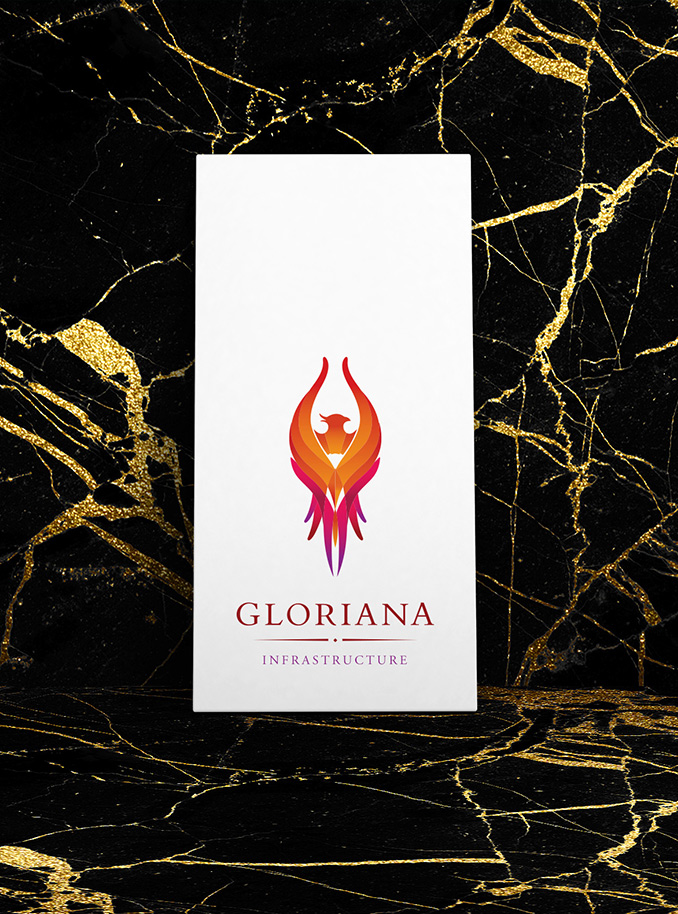
Using geometric structures, we designed a symmetrical Phoenix rising in its glory. The lines formed a diamond heart at its center, representing precious stones and vibrant Indian culture.
We chose colors like amber orange and deep magenta for their symbolic meanings.
Versatility of the Phoenix Logo
The Phoenix design could be beautifully represented as a jewelry pendant, brooch, or rings, while the geometric composition symbolized quality construction.
We further created a sub-logomark using the geometric lines without colors, to be used as a designer watermark across various collaterals.
.jpg)
Color Palette: Amber Orange and Deep Magenta
The top half of the Phoenix, in amber orange hues, symbolized the creativity, joy, and success of the jewelry side.
The deep magenta at its feet depicted balance and stability, representing the infrastructure side.
Stationery Design for Gloriana: Integrating the Brand Identity
The brand stationery design extended this theme, using the two color palettes in the typefaces to differentiate the segments.
We designed a vertical business card, breaking away from the usual landscape style, to visually showcase the flight of the rising Phoenix.
All hail the Glorious Phoenix!
.jpg)
The Dope* Impact
The resulting new logo thrilled the client, as it was versatile enough to represent both his jewelry business and infrastructure ventures.
The deep meaning of the Phoenix resonated with him and his ambitions for both businesses. The new visual identity significantly improved brand recognition and customer engagement, showcasing Gloriana's commitment to excellence and innovation in both sectors.


