Services
Brand Identity Design
- Brand Logomark design
- Brand Stationary design
Uberpips Forex is a London-based financial startup specializing in Forex trade and support.
The company aims to support traders by minimizing their financial risks and providing expert guidance in the volatile world of Forex trading.
.jpg)
The Deal
Design a corporate brand logo and identity for Uberpips.
Create cohesive and impactful stationery that aligns with the new brand identity.
Develop a tagline that encapsulates the essence of Uberpips' services.
.jpg)
The Dope* Process
Setting the Stage for Uberpips Financial Brand Design
This project was an exciting opportunity. The client discovered me through my website and loved my previous brand logo design projects.
High expectations? Check. But hey, no pressure.
Different fields require distinct branding approaches, and my task was to create a functional design that enhanced the brand and communicated their business clearly.
Understanding the Client's Vision for Forex Trade Branding
Our client, passionate about finance and Forex trade, wanted to support others entering the field and minimize their financial risks.
She threw in suggestions like bulls, bears, currency symbols, and Japanese candlesticks. Candlesticks? Typo, maybe?
Anyway, we dove into the Forex world, noticing that most logos were bogged down by globes, currency symbols, or plain typefaces. We decided to veer off the beaten path.
_1.jpg)
Diving into Symbolism for a Distinctive Forex Logo
Welcome to the animal kingdom! Bulls and bears rule the Forex market.
A bull market means rising prices and optimism, while a bear market spells falling prices and gloom.
Fun fact: bulls thrust their horns up (hence rising prices) and bears swipe down (falling prices). Thanks, Mother Nature, for the perfect metaphors. :)
Crafting the Forex Logo Design for Uberpips
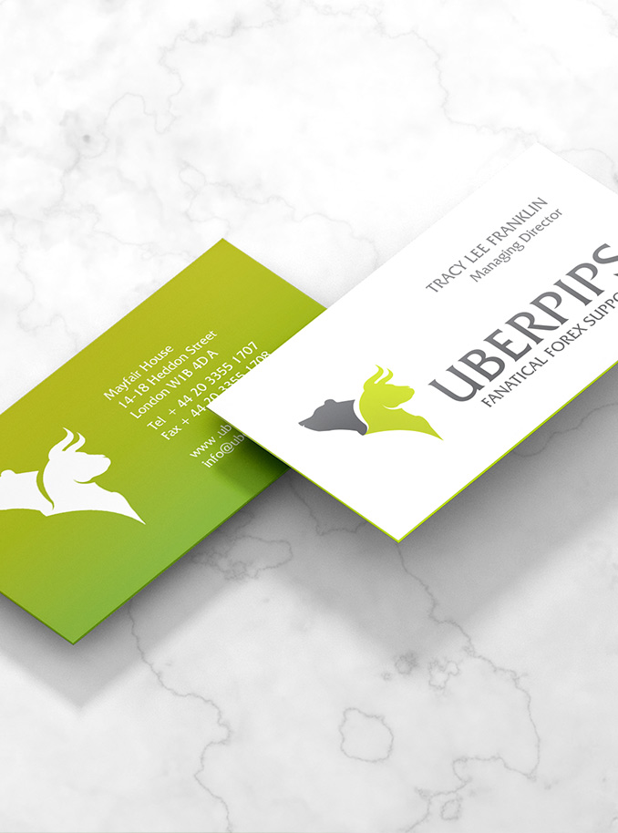
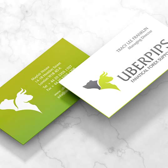
Armed with this symbolism, we created a bold emblem symbolizing strength and stability.
Given the client's mission to minimize financial risks, we placed the bull front and center – optimism, charge ahead! The bear, balancing from behind, added the necessary caution.
This design neatly showcased the dual nature of the financial world – a dance between optimism and pessimism.
.jpg)
Typography and Tagline Development for Uberpips
We chose a bold serif typeface to scream strength and professionalism.
The tagline, "Fanatical Forex Support," perfectly captured the brand's passion and commitment. Because who wouldn't want fanatical support in the volatile world of Forex?
.jpg)
Color Palette and Stationery Design for Financial Branding
Corporate grey and mint green – a nod to positivity, growth, and yes, the universal color of money.
We infused this theme across the brand's stationery, ensuring consistency and injecting the brand with a healthy dose of energy and optimism.
So there you have it: the bull and bear, locked in their eternal battle of optimism and pessimism.
That's some serious money dope, y'all.
.jpg)


