Services
Brand Identity Design
- Brand Logo
- Brand Stationary
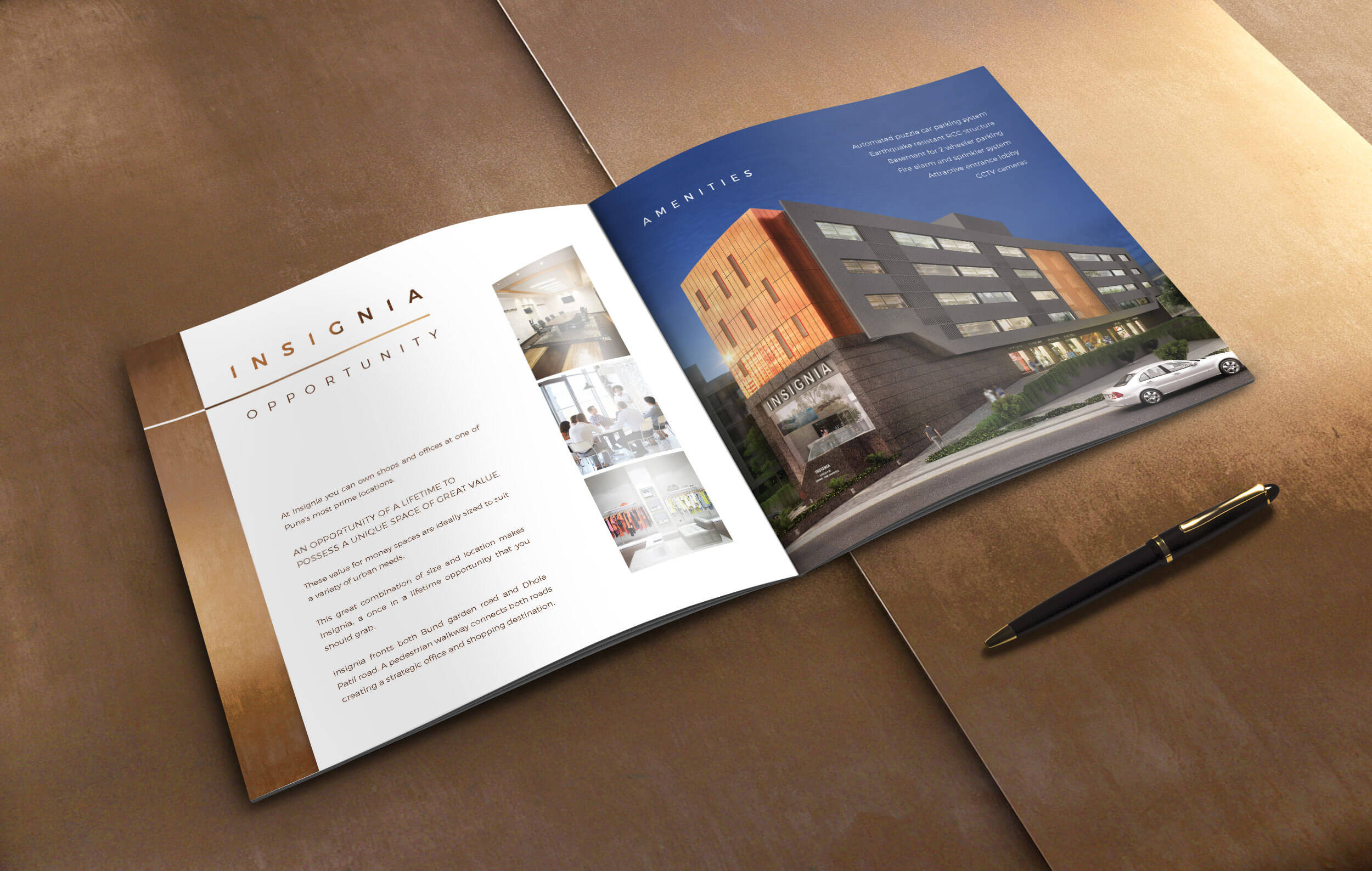
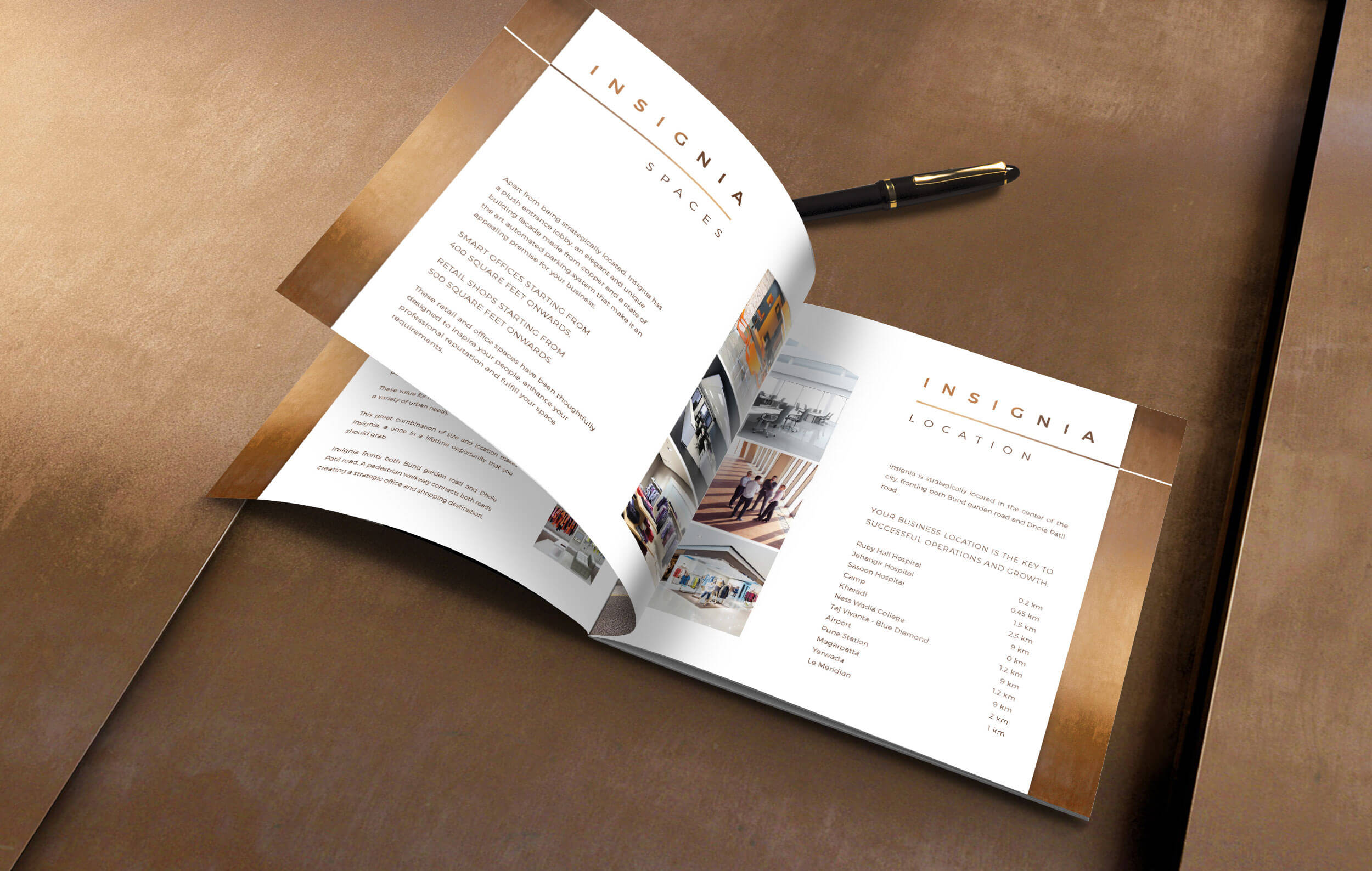
- Brand Brochure
Insignia is a premium commercial property designed to attract ambitious entrepreneurs, retail brands and financial institutions.
The developers wanted a brand identity that matched the building’s bold personality and helped position it as a standout space in a crowded city landscape.
This project mattered because Insignia wasn’t selling square feet.
It was selling pride, presence and a front-row seat in a fast-growing business district.
The Deal
Create a Brand Logo & Identity for a new premium commercial property
Capture the uniqueness of the building’s full copper facade
Design the corporate brochure and marketing materials
Ensure the identity feels timeless as the copper ages naturally
The Dope Process
A project built on a single question:
What makes this property different?
The answer was staring right at me - its face.
Finding the Core Idea
The full copper facade was impossible to ignore. Not because it was loud, but because it aged with time, almost like a living skin.
Most properties brag about amenities. Insignia didn’t need to. Its architecture carried its own story.
The architect had designed the minimalist building to be a business hotspot for entrepreneurs, startups, retail brands or financial institutions.
Having a copper facade that would naturally provide a stunning metallic sheen to the structure was a first for the city.
And ignoring that would have been a crime.
A design sin, honestly :)
Building the Brand Logo
The meaning of Insignia hints at identity, belonging and a mark of pride.
That felt like the right starting point.
I shaped the logo around the letter I, keeping it upright, confident and true to the minimalist architecture. The form echoes the copper panel layout from the facade, creating a subtle but strong link between the logo and the building.
To maintain consistency, both “I”s in the wordmark were replaced with this mark.
The result: a flexible identity that looks premium without trying too hard.
Designing the Colour System
Copper was the hero, but using it everywhere would have made the brand look like a hardware showroom.
Instead, I recommended copper foiling across stationery to hint at the building’s signature material without overwhelming the design.
For media where foil wasn’t possible, we used a carefully matched copper shade.
It kept the brand connected to the building without pretending to be a shiny metal at all times.

Extending the Identity
The brochure carried the idea forward with clean layouts, warm metallic cues and a confident tone.
The goal wasn’t to oversell the property. It was to let its architecture do the talking while the brand identity supported that story with clarity and elegance.
The Dope Impact
Insignia now has a visual identity that proudly mirrors its architecture.
The logo feels connected, the copper detailing creates instant recall and the brand system gives the developers a premium, cohesive presence across touchpoints.
The property got its own brand signature and is currently sold out.