
Services
Brand Identity Design
- Brand Logo
- Brand Stationary
- Brand Profile Brochure
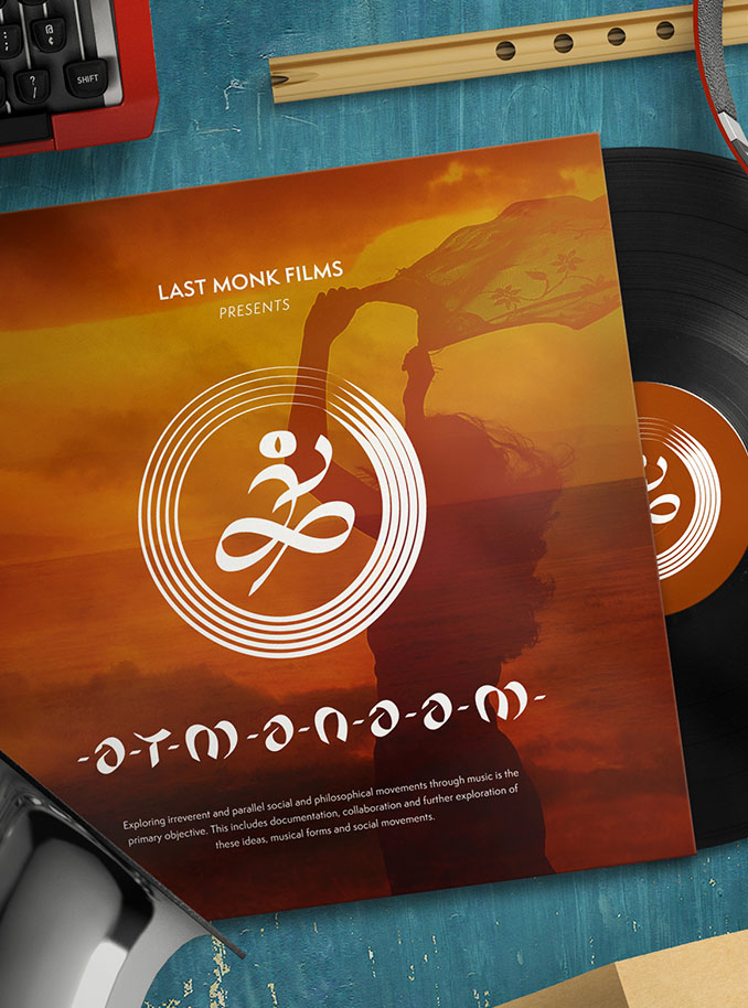
Atmanaam is a docu-series that dives into the spiritual, cultural and musical intersections found across five global musical movements.
The creators wanted a brand identity that could travel as freely as the music itself from screen to stage to merchandise - without losing its raw, human spirit.
A project rooted in truth, tradition and artistic exchange?
Hard to say no to that.
The Deal
Create a brand logo and identity for a musical documentary exploring five spiritual and tribal-influenced music traditions.
Build a logo flexible enough for motion, merchandise and cross-cultural collaboration.
Capture the soul of a global music journey without slipping into typical “world music” clichés.
Keep the expression simple, honest and symbolic.
The Dope* Process
Finding the Core Idea
Atmanaam wasn’t about polished commercial soundscapes. It leaned into something older ~ tribal, spiritual, lived.
So the visual direction needed to echo that simplicity without feeling primitive for the sake of aesthetics.
The music movements ~ Kabir’s Nirguni, Baul, Warkari, Gypsy, and the folk traditions of South India ~ all carry one thread: the idea of truth as an infinite experience.
The client even described it beautifully… though leaning on poetic philosophy alone felt risky for the logo. Symbolism works best when grounded, not floating in deep metaphysics.
So yes, the infinity symbol came up. And yes, it felt a little too predictable at first. But instead of discarding it, I treated it as one ingredient, not the hero.
Tribal art offered the real breakthrough ~ its quiet confidence in simple shapes and strokes. No drama, no decor. Just form carrying emotion.
That gave the identity a direction: reduce, refine, honour the music.
Building the Logo
During sketching, three elements kept returning like a stubborn tune :
A musician ~ not defined by an instrument, because that would trap the identity in a box. The only universal constant is the human being making the music.
A hint of infinity ~ not the cliché loop, but a more organic flow representing the evolving truth musicians search for.
Five circles ~ each moving at its own rhythm. Not ornamental, not random. Music at its core is vibration, and circles were the cleanest way to show that pulse.
Together, they formed an abstract visual story:
A musician seated on the earth, lines flowing into an infinity-like form, surrounded by five circles of varying thickness ~ each one echoing a musical movement.
Simple. Human. Rhythmic.
And thankfully, far from the predictable path a documentary logo usually takes.
Extending the Identity
The brand name typography was custom-drawn in loose brush strokes.
Nothing uniform, nothing too polished ~ because conformity would contradict the entire philosophy of the project.
Between each letter, I added small dashes representing musicians holding hands. A subtle nod to unity, not a loud shout.
Tribal, but contemporary enough to live comfortably across digital and print.
The final identity carried the warmth of handmade art with the clarity needed for modern use.
The Dope* Impact
The brand identity gave Atmanaam the visual soul it needed.
One that could move effortlessly from film frames to album covers to live performances.
More importantly, it gave the musicians a symbol that felt true to their journey: simple, infinite and rooted in human expression.