Services
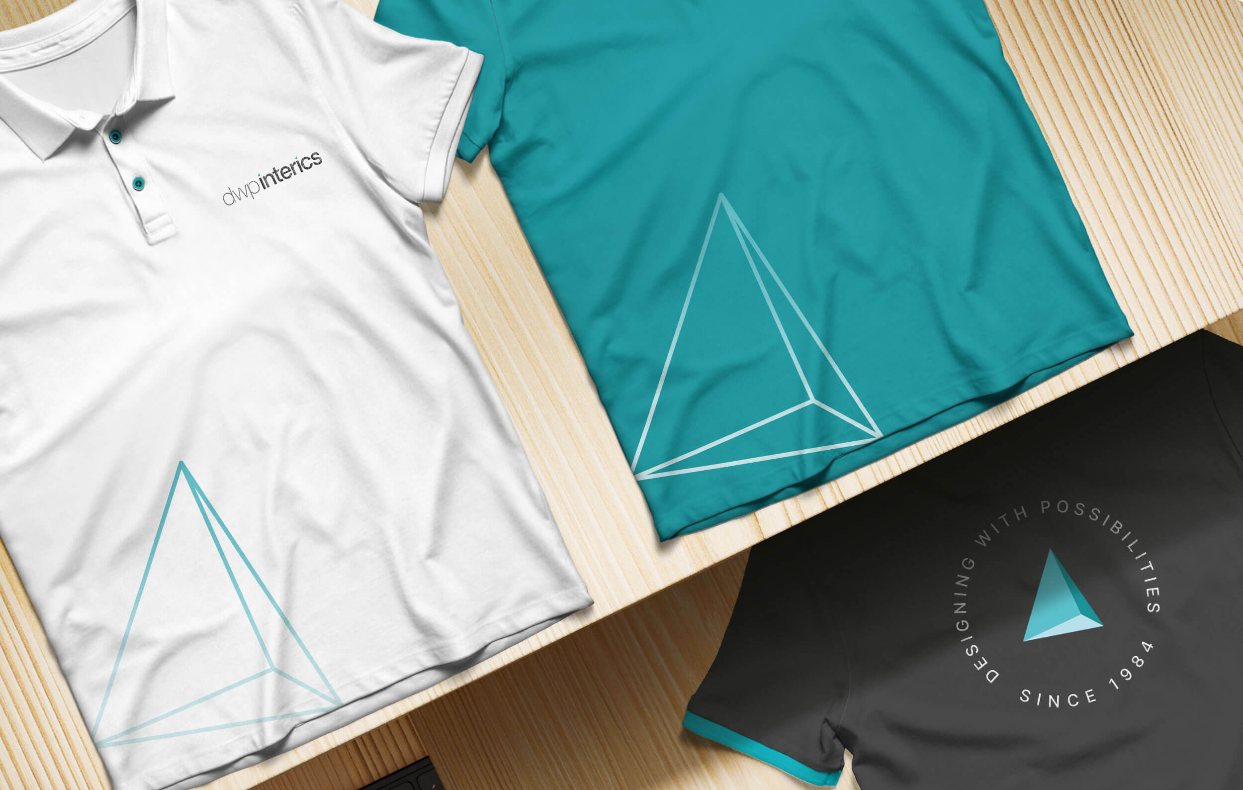
Brand Identity Design
- Brand Visual Design Strategy
- Brand Logo & Identity Redesign
- Brand Slogan Development
- Responsive Website Design
- Brand Information Architecture
- Brand UX Direction/UI Design
- Brand Content Structure/Writing
- Corporate Profile Presentation System
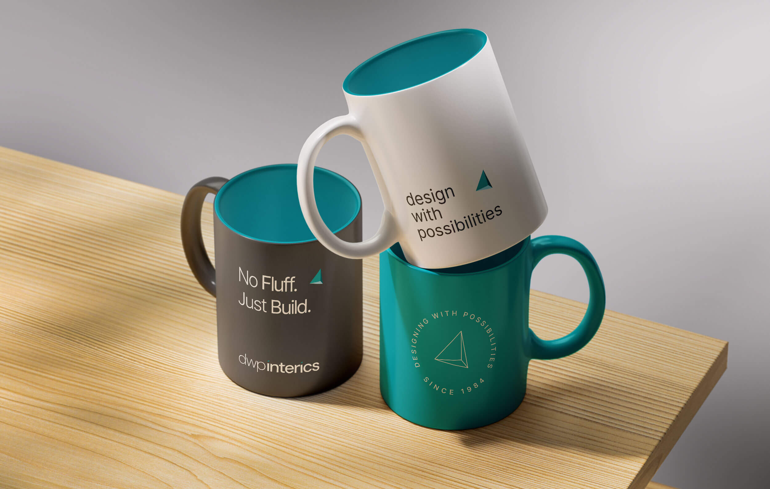
- Brand Merchandise
dwp interics is one of India’s leading architecture and workspace design firms, carrying more than forty years of experience and a portfolio that spans over 700 global and corporate brands.
As the firm’s scale and visibility grew, their digital presence needed to grow with it. The earlier website had supported them well for many years, but the brand had matured, and it deserved an online experience that reflected that clarity and confidence.
What began as a simple website refresh naturally expanded into a broader identity refinement while keeping its foundation intact.
My role was to shape it with more focus, intention and ease so the brand feels aligned with who dwp interics is today and where they are moving next.
The Deal
Refresh the dwp interics website for a cleaner and more current presence
Improve the structure, flow and clarity of content across the site
Refine the visual design expression while keeping the core identity intact
The Dope* Process
Starting with the Website
The project started with a straightforward goal: create a cleaner and more current website that matched how dwp interics presents itself today.
The earlier website had played its part well, but the brand had grown, and the digital experience needed to reflect that shift.
As I restructured the pages and rewrote the content, a deeper layer surfaced.
The brand had evolved.
The way they spoke had evolved. Their clients’ expectations had evolved.
Naturally, the project moved beyond the website and into clarifying the identity that sits behind it.
This refinement wasn’t about changing who they are. It was about expressing it with more clarity and purpose.
Understanding who they are Today
dwp interics is a forty-year-old firm with a strong legacy in architecture and workspace design.
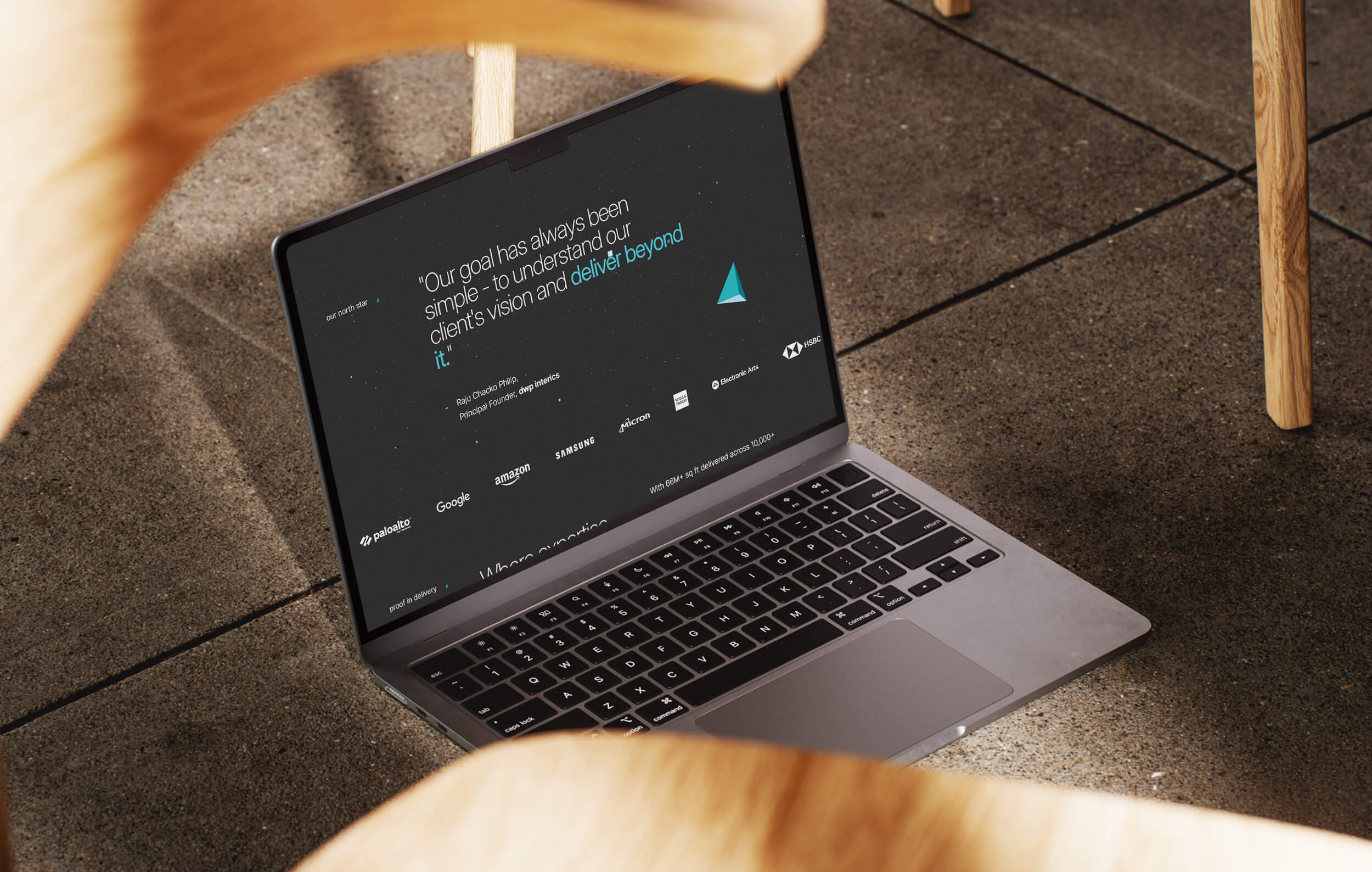
Their portfolio covers more than sixty million square feet, and they have delivered projects for Fortune 100, Fortune 10 and Fortune 5 companies.
I’ve worked with the brand for more than fifteen years - from designing their original logo to creating each version of their website over the years.
This long partnership allowed me to understand how the brand thinks and the level of clarity their clients expect.
You can explore the previous chapter of this journey here.
For this chapter, the goal was simple: keep the core intact and express who they are today with more focus and confidence.
Evolving the Brand Message
While shaping the website content, the slogan came back into focus.
“design with passion” had supported the brand for many years and still held meaning, but dwp interics had grown into a far more capable and directed organisation.
Their clients already expect great design.
What they truly value today is the way the company thinks, delivers and moves projects forward.
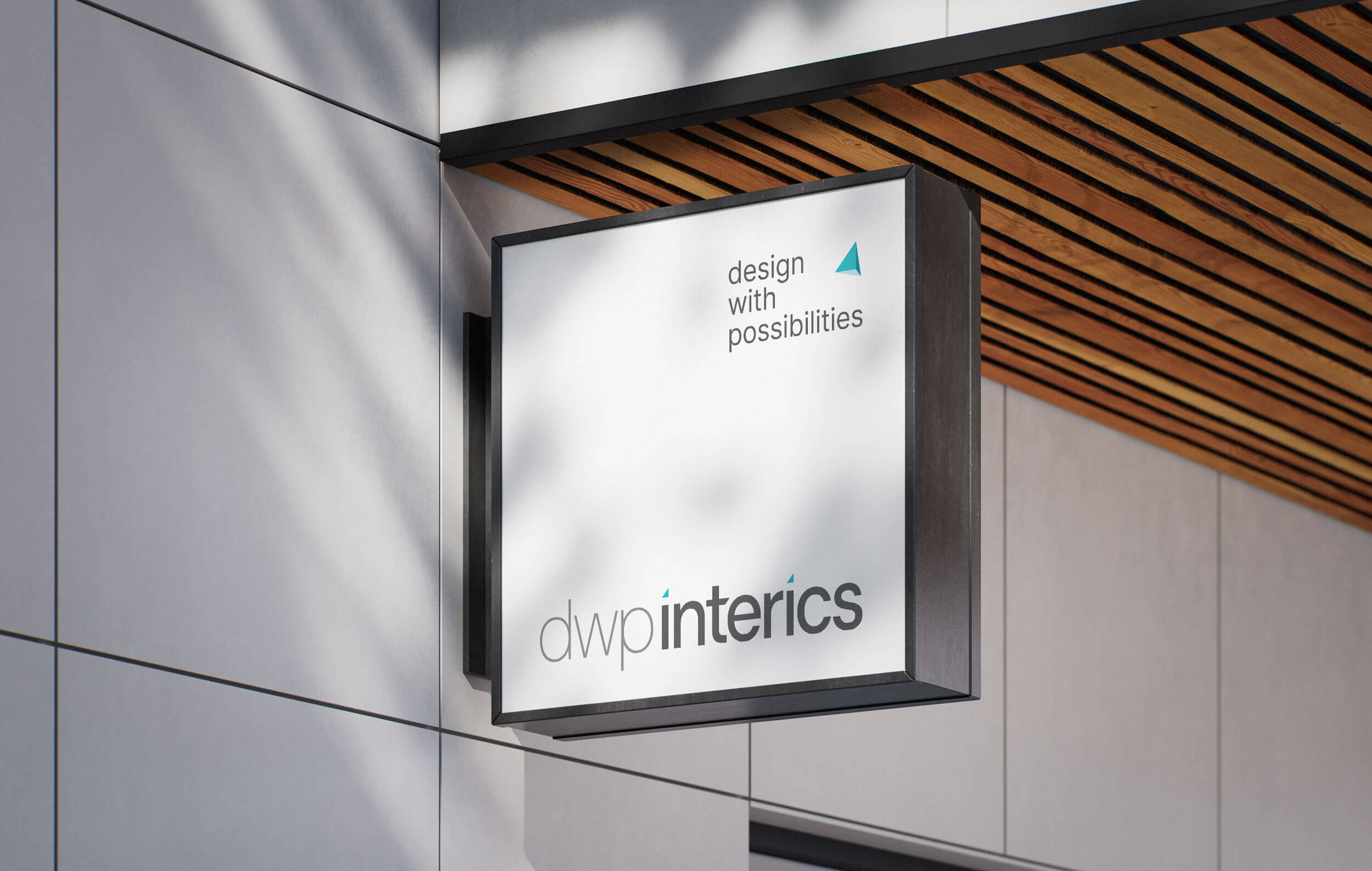
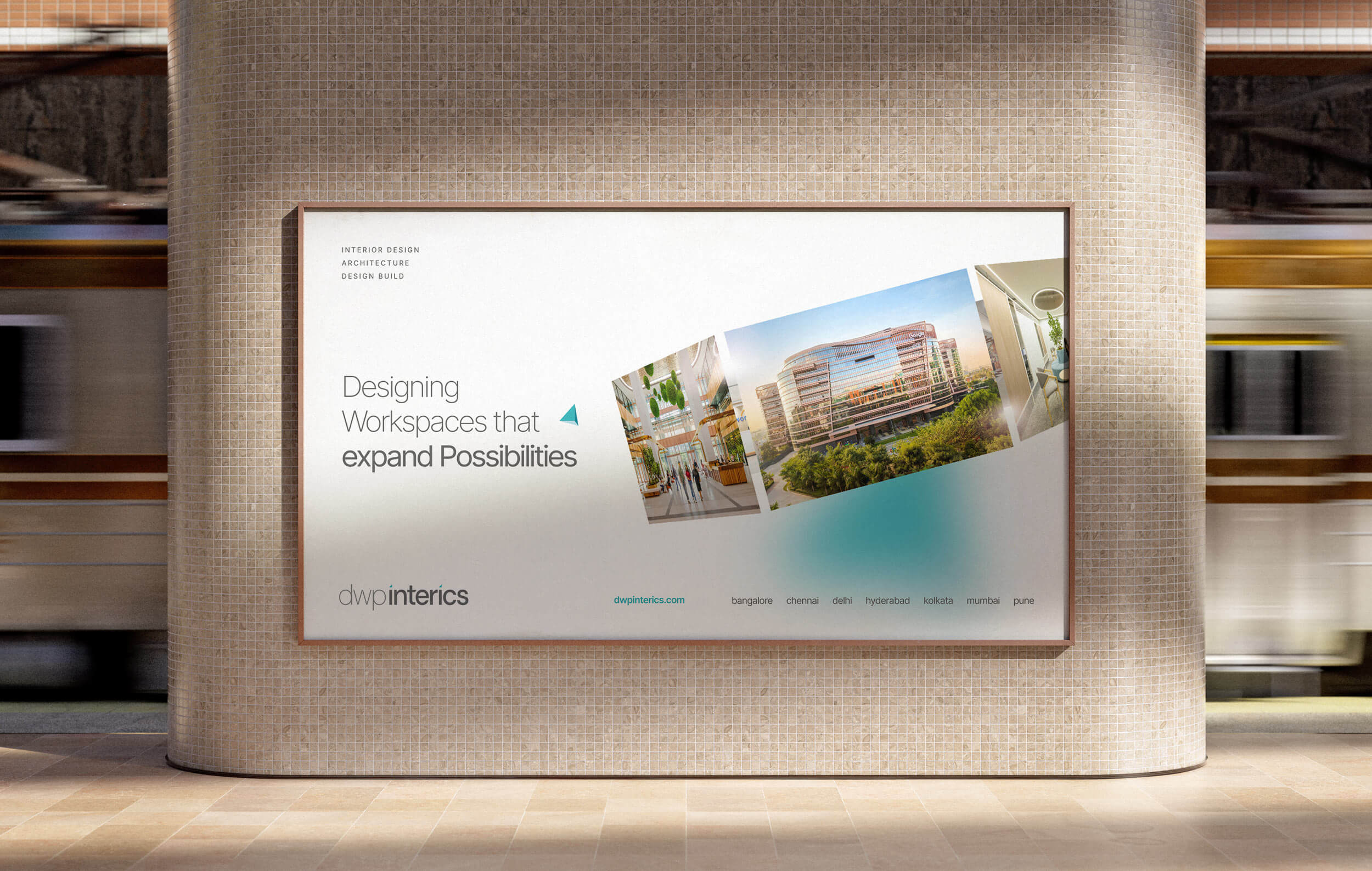
“design with possibilities” came from that shift.
The line stays rooted in the brand’s legacy while expanding its meaning moving from passion to a broader sense of capability, flexibility and forward thinking.
It also aligns naturally with the dwp acronym, making it easier to adopt across conversations, presentations and everyday use.
Refining the Brand Logo
The goal was not to change the dwp interics logo, but to sharpen it.
The original structure stayed the same, while subtle refinements made the identity feel clearer and more confident across digital use.
We refined the typeface weight, adjusted the proportions and strengthened readability. These updates helped the logo perform better at different sizes, especially on the new website and on mobile.
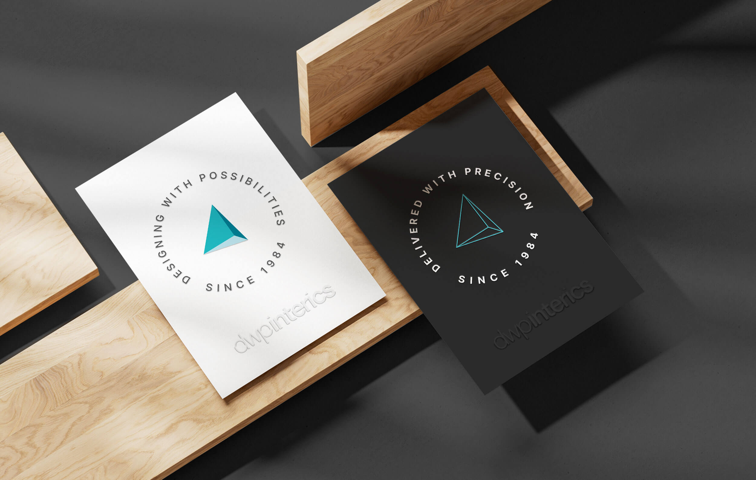
The Triangle to Compass Evolution
The triangle has always been part of the dwp interics identity. It sits above the “i” and has quietly symbolised balance and structure since the early days of the brand.
For this update, we brought the triangle forward and gave it more purpose.
By refining its angles and proportions, the same shape evolved into a compass as a symbol of direction, clarity and forward movement.
The three sides of the compass connect back to how the company works: People, Process and Progress.
This 3D asset adds visual depth and focus across the website and stays rooted in the original mark.
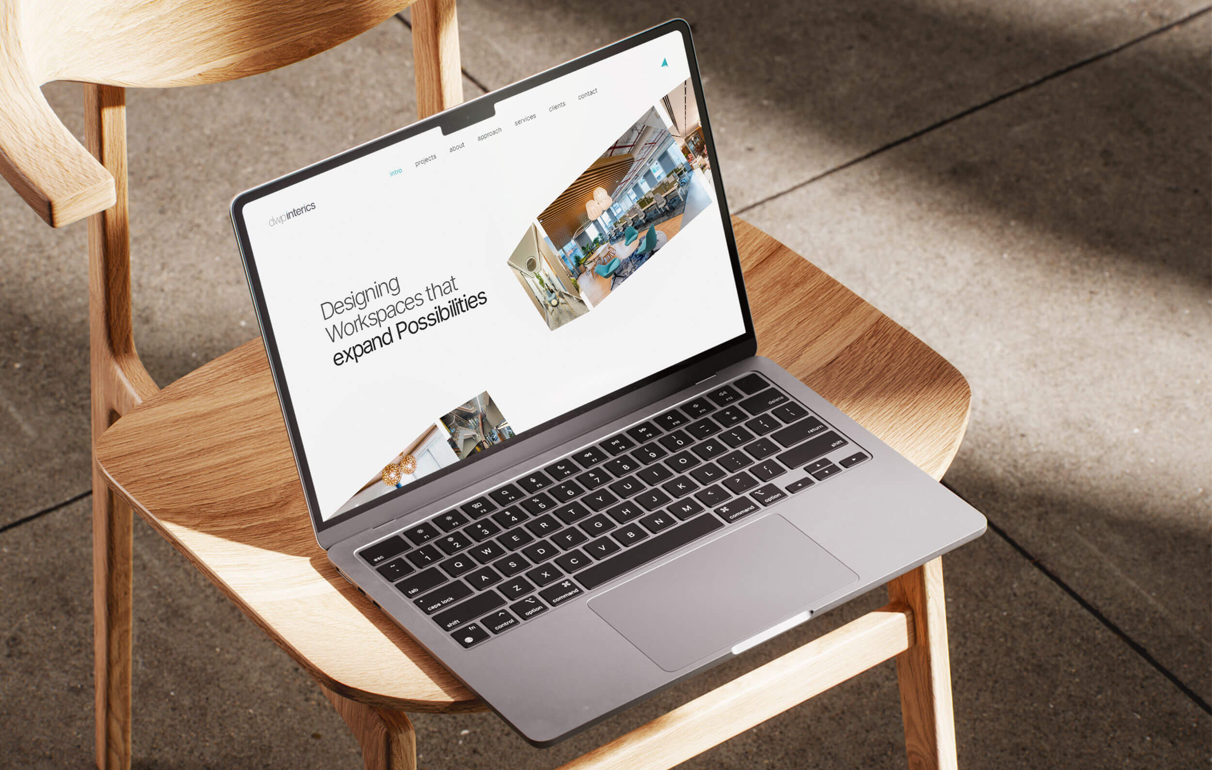
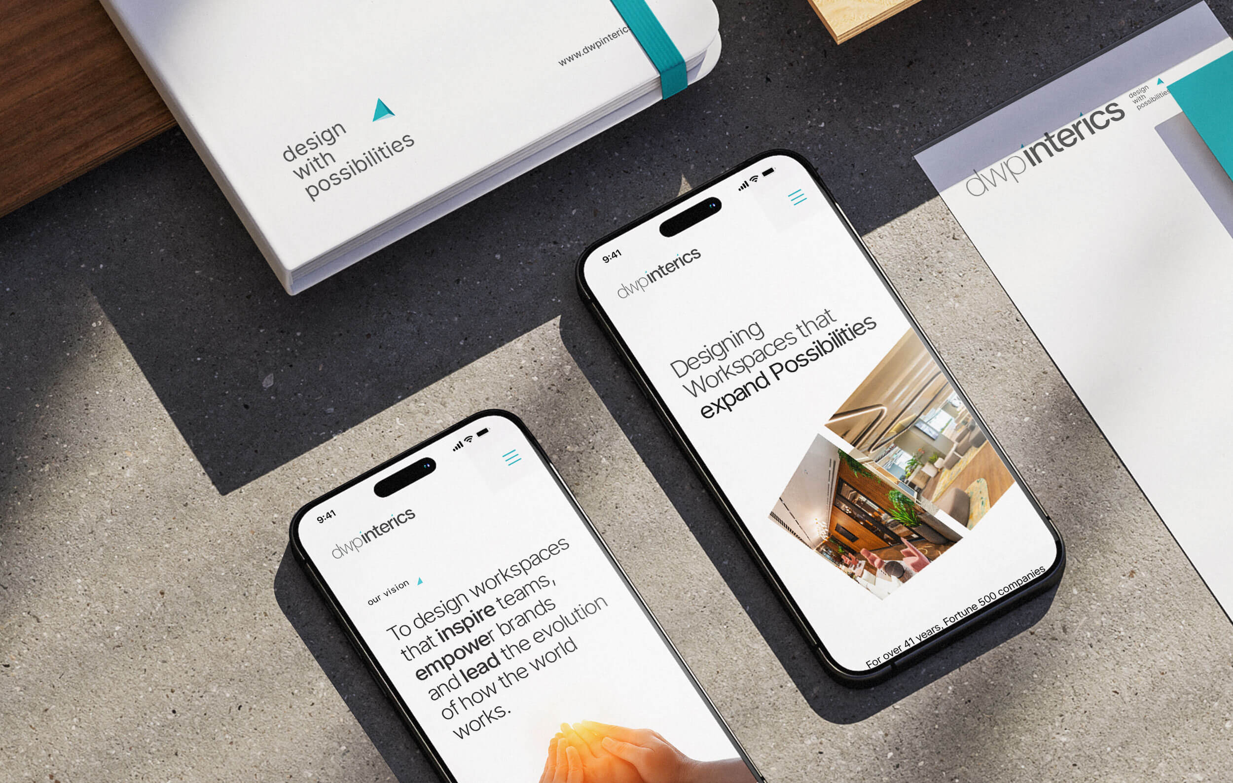
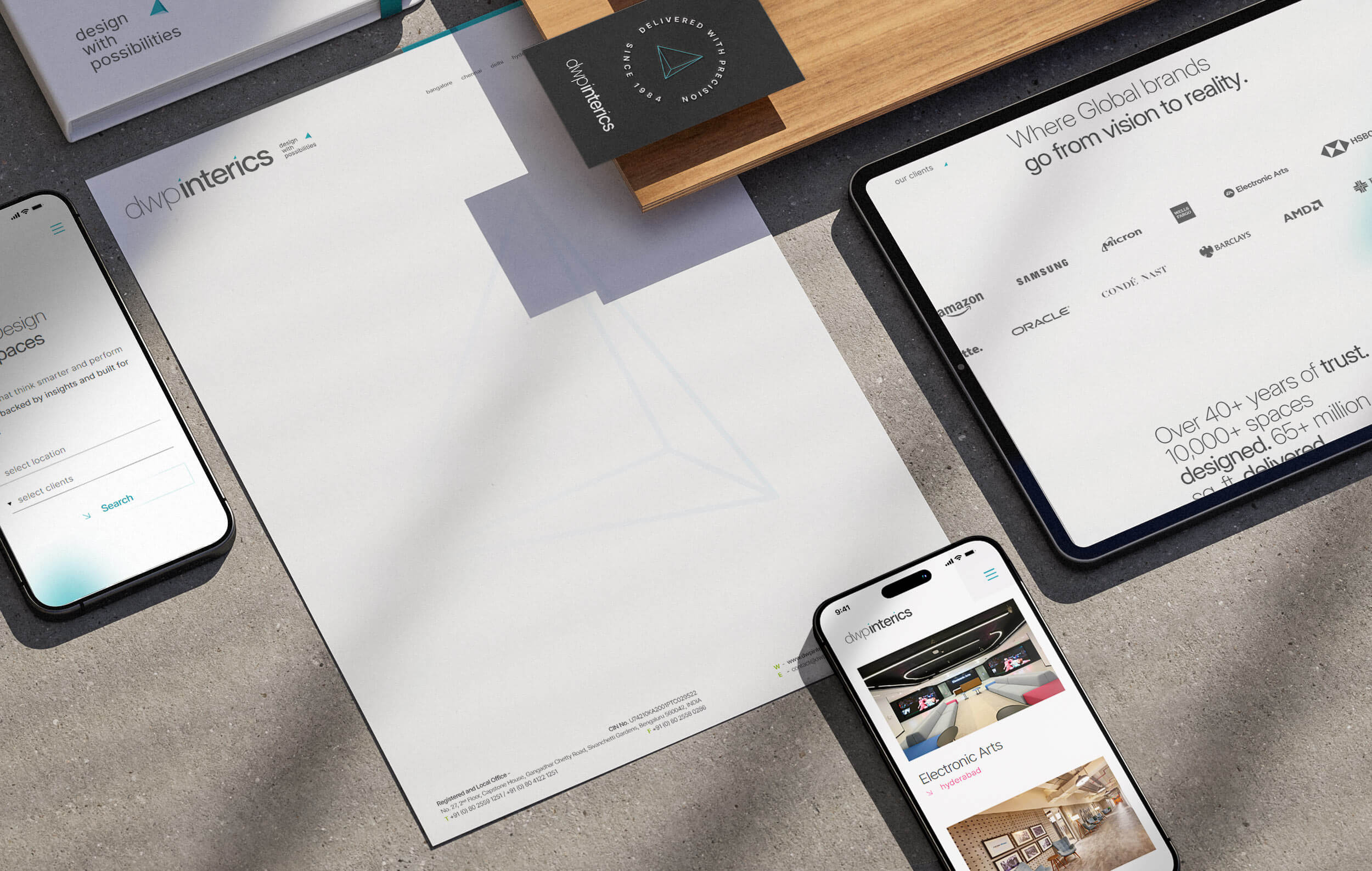
Building a Clear Website Structure
The first step was to simplify how information flowed across the website. dwp interics works with leaders and decision makers who look for clarity and move fast, so the experience needed to feel intuitive from the first scroll.
We streamlined the pages, tightened the content and built a clearer hierarchy. This made it easier for visitors to understand what the company does and find what they need without friction.
The intention was simple: remove the unnecessary, highlight what matters and let the website mirror the maturity and depth of the brand.
Designing the UI for Modern Use
With the structure in place, the next step was designing a clean and purposeful interface. The website needed to feel simple, confident and easy to use on any device.
The new compass asset appears softly in the background to add depth to the white, keeping the layouts open and focused.
In a space where many websites feel heavy with movement, a quieter approach helps visitors stay with the message.
Typography, spacing and visual rhythm were refined to support clarity. The result is a minimalist UI shaped around how decision makers read, think and act.
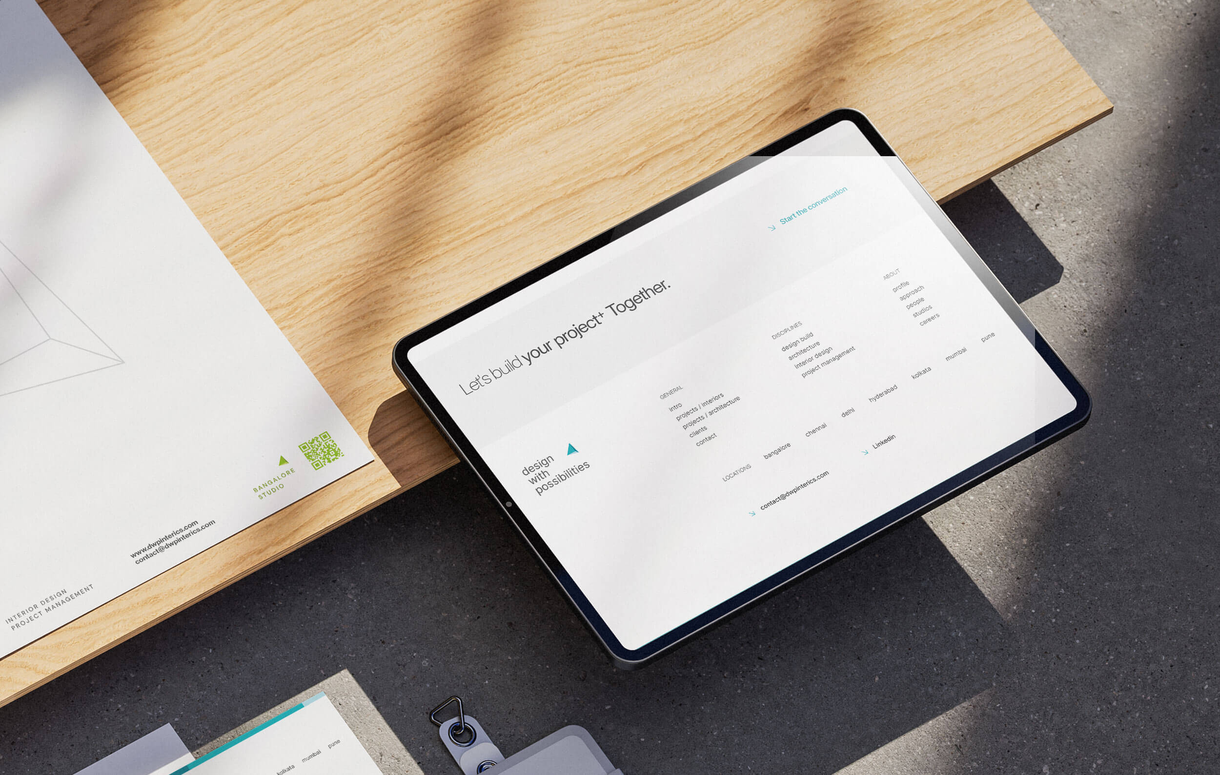
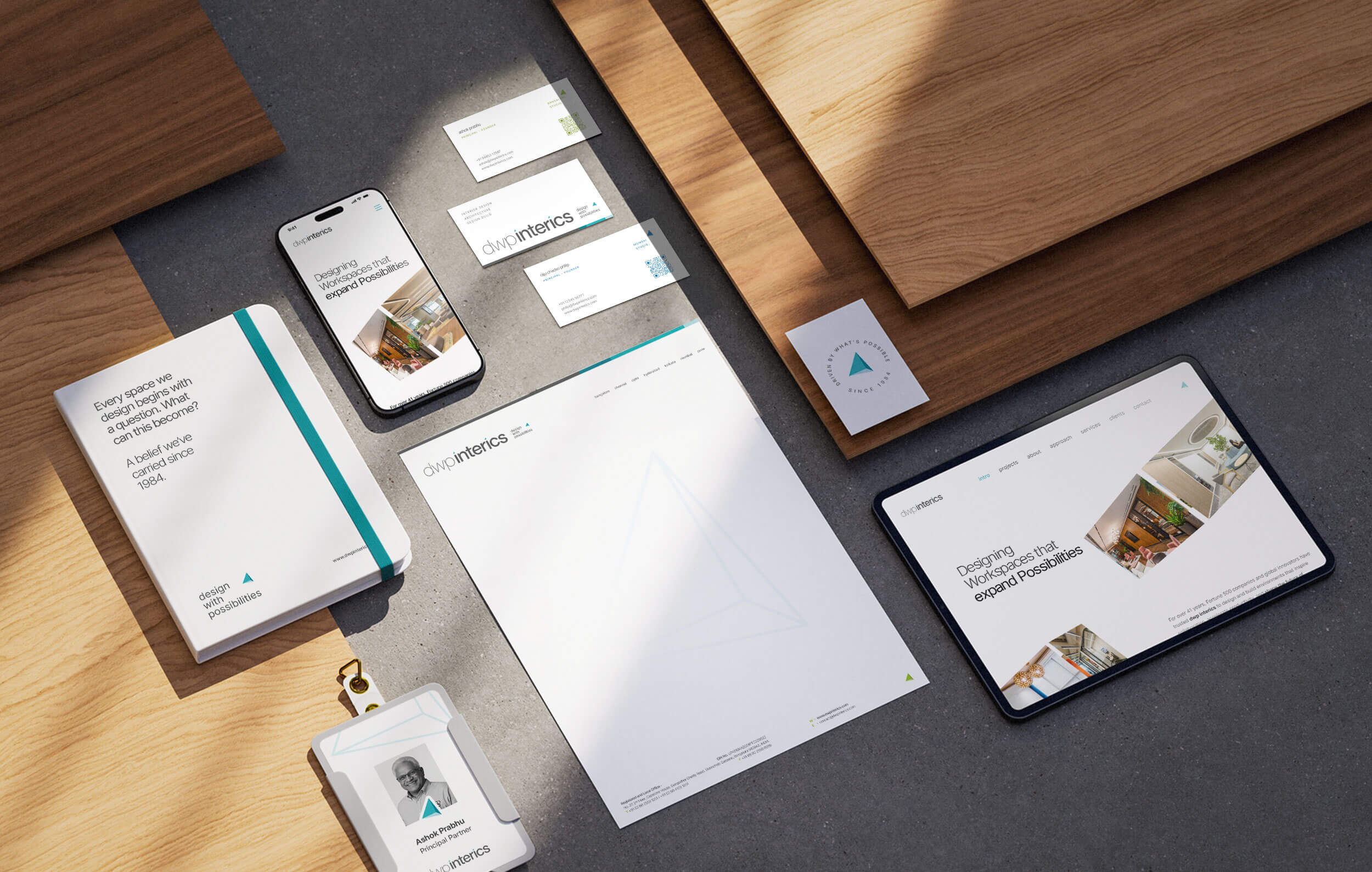
Rolling Out the Identity
With the refined identity in place, the next step was extending it across key communication touchpoints.
The goal was to keep everything simple, consistent and easy for the team to use in their day-to-day work.
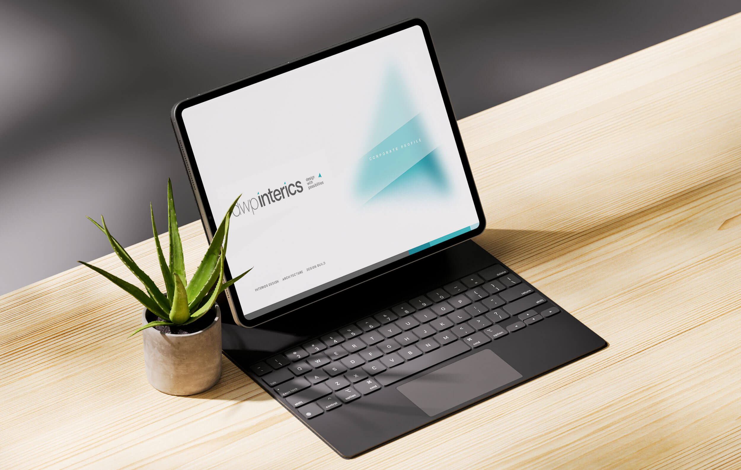
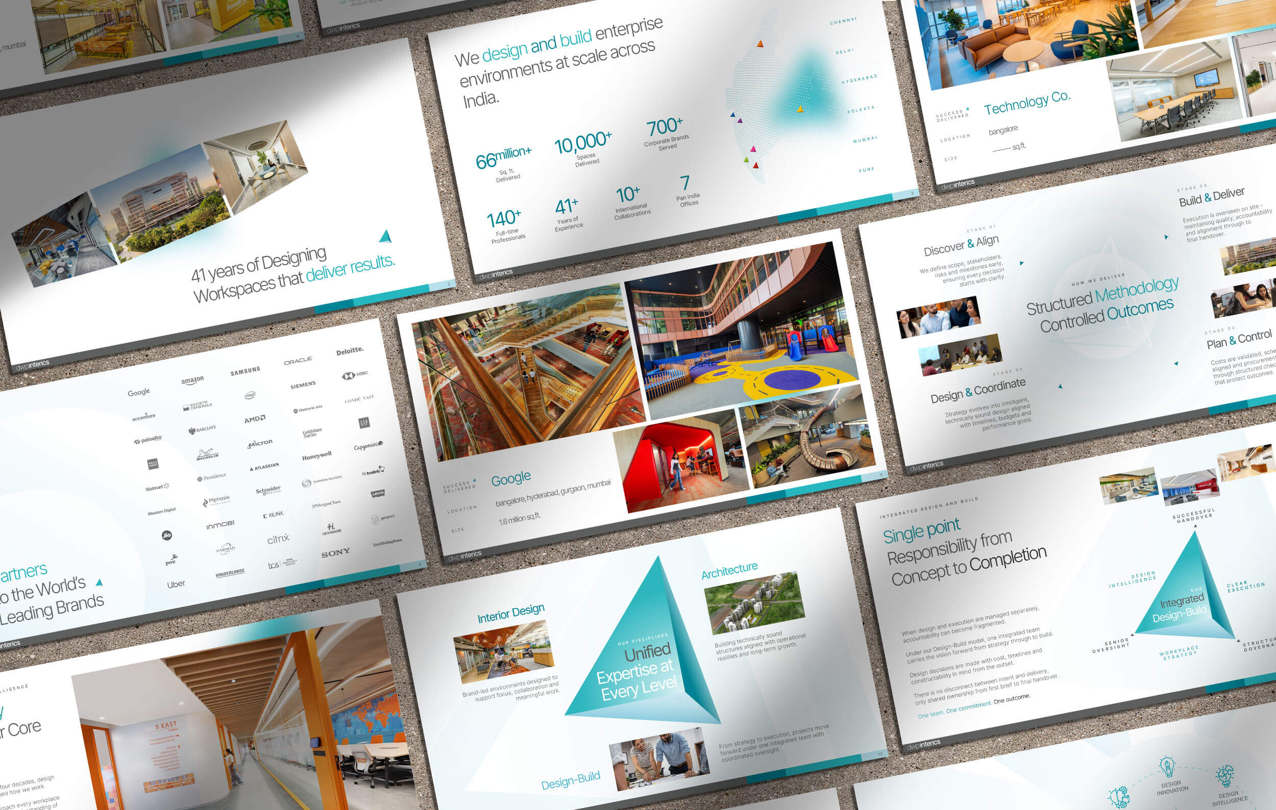
Corporate Profile Presentation System
Alongside the identity rollout, the company’s corporate profile was completely restructured.
The presentation was rewritten and reorganised to communicate the scale, services and project portfolio of the firm with greater clarity.
Rather than delivering a static deck, the profile was built as a structured PowerPoint template system. This allows the internal team to update slides, add projects and create new presentations without breaking the design.
Usage guidelines were also provided so the team can maintain brand consistency while editing the deck internally.
The result is a communication tool that helps dwp interics present complex work with clarity while remaining easy for the team to manage over time.
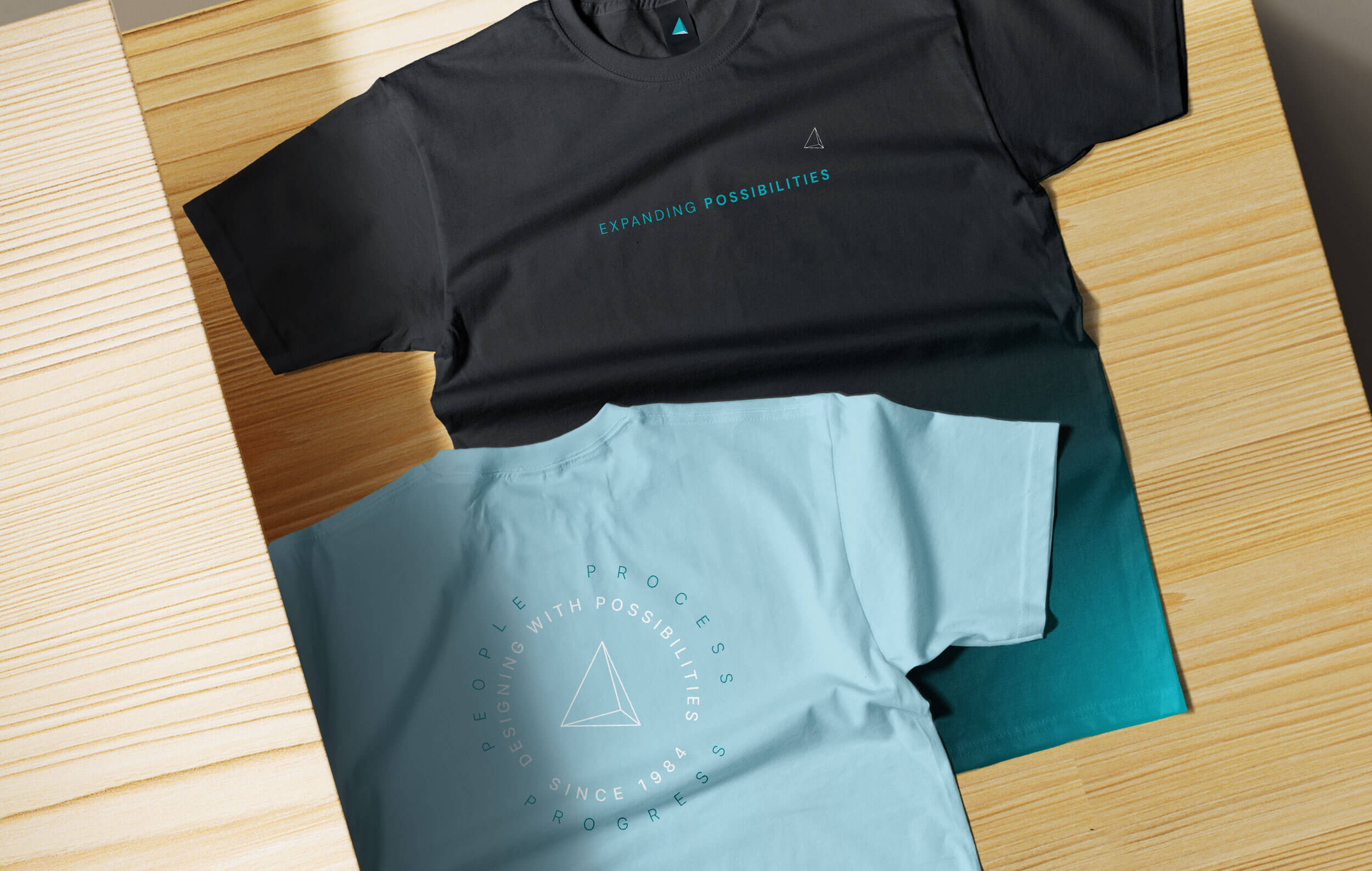
Brand Touchpoints
• Updated Business cards with QR Codes to enable quick saves on mobiles
• New digital letterheads
• GIF-based email signatures for the full team
• Office signages
• 40year legacy mark
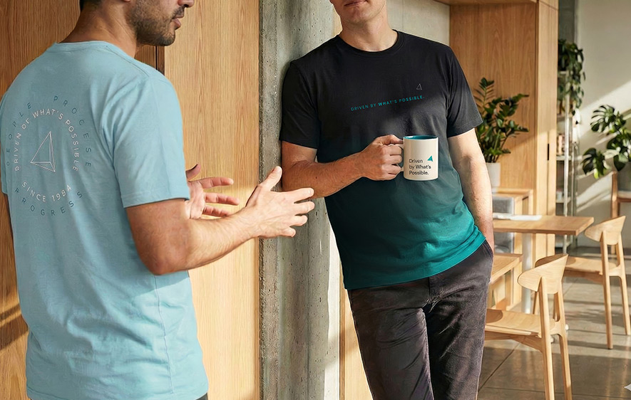
• Branded apparel
• Merchandise for workplace culture
These elements helped the identity feel cohesive, practical and ready for everyday use.
The Dope* Impact
The refined identity helped dwp interics present itself with more clarity and confidence. The updated logo, message and visual system created a stronger sense of focus across the brand.
The new website is lighter, easier to navigate and more intuitive for decision makers who move fast. It reflects the scale of the company and the clarity they bring to each project.
The updated stationery, merchandise and internal assets created a more unified brand presence.
These elements give the team a clear foundation for building a consistent brand experience over time.
Explore the live website → www.dwpinterics.com
Happy Founders

Raju Chacko Philip
Dwp Interics Pvt. Ltd.
Founder, Entrepreneur
His creative expertise and unique design solutions as visible on our website is the reason I have retained him as our brand design consultant for the last 15+ years.
"Rajesh came in to redesign our brand logo and identity and create a minimalist website that matched our ethos.
I have a high regard for him professionally as well as personally and would highly recommend him to those who understand the importance of creative and strategic design solutions when it comes to brand logo and identity creation."