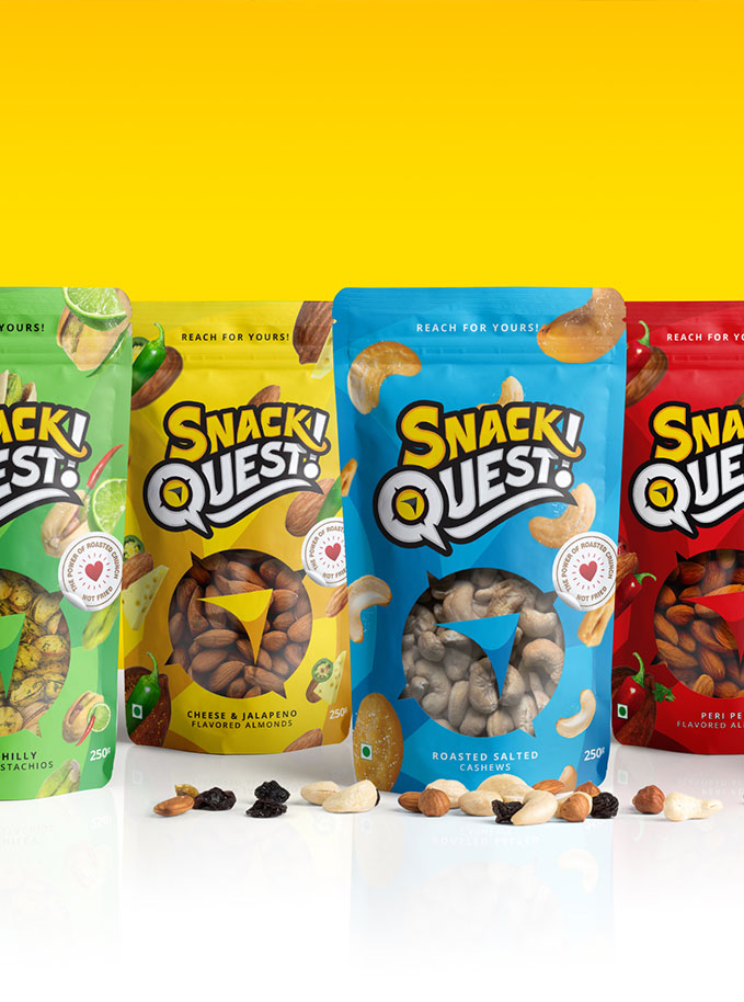
Services
Brand Identity Design
- Brand Logo Redesign
- Brand Identity Redesign
- Product Labels Redesign
- Brand Product Packaging
- Brand Promotion Graphics
- Brand Style Guidelines
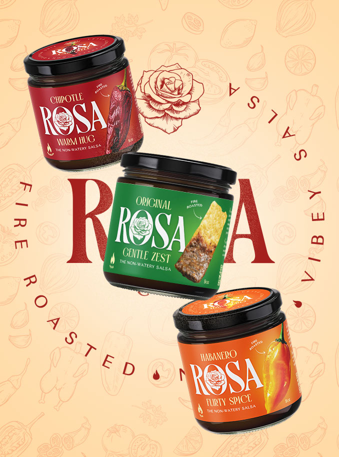
A redesign that helped this fire-roasted favourite step into its next chapter.
Rosa Salsa is a small-batch, fire-roasted salsa brand built on flavour, heart and a whole lot of Texas charm.
It was created by Nick Fenn, who had been selling jars at local farmers markets for a while. The salsa was a hit. But the brand felt like something he had simply put together to get things going. It didn’t quite match his vision for where he wanted to take Rosa next.
Nick was clear about who the brand was for, what it stood for, and what it needed to become.
That’s when Justin Ancheta, - Nick’s best friend, a brand strategist, and someone I’ve worked with on several founder-led projects got in touch and brought me in to redesign the visual identity.
The goal was simple. Keep Rosa’s spirit intact.
Give it the presence and confidence it needed to grow.
.webp)
The Deal
A full redesign of Rosa’s visual identity to prepare the brand for store shelves.
Refine the brand’s personality through a bold, flavour-forward identity
Create kick ass packaging labels for three core flavours
Develop a distinctive wordmark with roots in heritage and craft
.webp)
The Dope* Process
How clarity, trust, and some fire-roasted flavour shaped the new identity
Before the first design was created, we kicked off with one thing that makes all the difference - clarity.
Nick and Justin shared everything from brand voice notes and moodboards to vision docs and early logo explorations.
They weren’t guessing. They had a strong sense of who Rosa was and what she needed to become.
Rosa wasn’t born in a factory. It was shaped by memories that travelled from a Mexican kitchen to Cairo and finally Austin. When Nick couldn’t find anything like it on shelves, he made it himself. Fire-roasted, thick and bold.
That context helped me build a visual direction that was layered, flavourful and grounded from the start.
.webp)
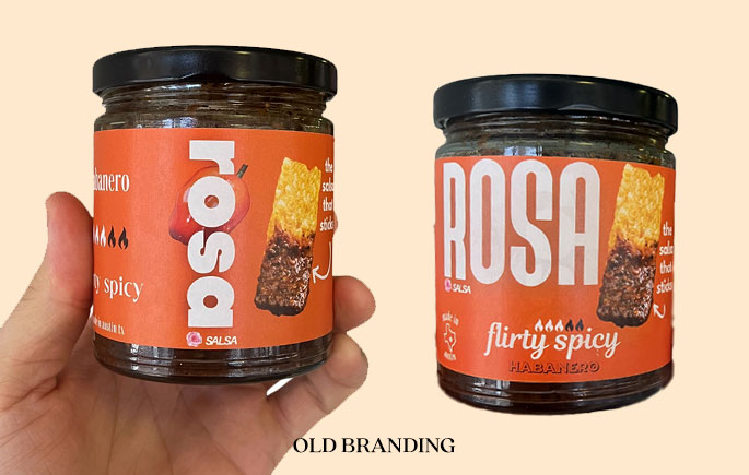
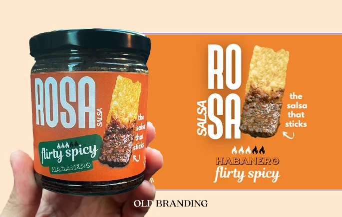
The first concept wasn’t off. It was a step forward.
The initial design was rich in detail. It included hand-drawn elements, a serif wordmark, warm gradients, and packaging with a crafted, artisanal feel.
Nick liked much of what he saw. But the overall vibe felt more Mediterranean than Mexican. That single insight helped shape the next direction.
Instead of scrapping it all, we carried forward what worked like the illustrations, the attention to layout and focused on what needed a shift. Colour. Mood. Edge.
Design is rarely a straight line. This pivot made the next steps stronger.
Typography that evolved with every round
The wordmark started with a carefully chosen typeface that had presence and personality.
It felt like Rosa. Bold, warm, and expressive without being overly styled.
From there, I modified it across rounds to fine-tune the balance.
Nick’s feedback played a big role here and wasn’t afraid to go letter by letter. The R needed more strength. The A had to feel less ornate. The S needed slimming down. The O needed more texture.
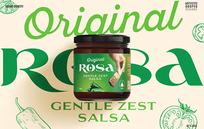
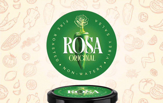
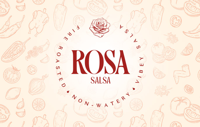
The name Rosa comes from sabrosa in Spanish for “tasty.”
The rose embedded in the letter O wasn’t just a design flourish. It was a quiet symbol that tied together name, meaning and mood.
Enriching the ambience of every meal it was a part of.
The final result became the backbone of the identity used consistently across the packaging, digital touchpoints and future merchandise.
.webp)
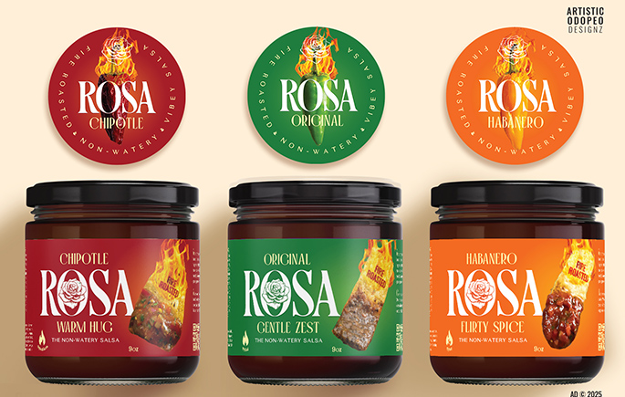
Designing with limited space and unlimited intention
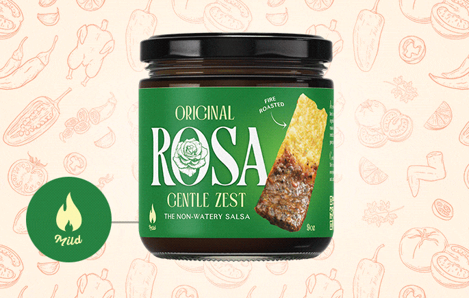
The packaging labels had one constraint - real estate. The jars had small surfaces, which meant every design choice had to do more with less.
So the layout was planned with clarity and flow. We chose bold, flavour-specific gradient colours for each variant to add warmth without clutter.
.webp)
To increase visibility, I introduced circular lid labels, a simple move that made a big difference.
Whether the jars were on a shelf or a kitchen counter, the top view now worked just as hard as the front.
“The non-watery salsa” wasn’t just a tagline. It was product truth.
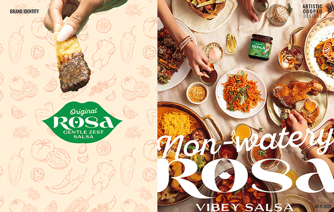
One label variation featured ingredient visuals. The other showed a chip dipped into salsa.
This gave Nick flexibility in how he wanted to present the product across different settings.
.webp)
Bringing it to life before it hit the shelves
To help Nick and Justin visualise the direction, I shared AI-generated visuals and mockups, jar renders, posters, and flavour slides.
These weren’t just for show. They helped speed up decision-making and made each round clearer than the last.
Even with multiple iterations, the core of Rosa’s new identity held steady.
It wasn’t about reinventing her. It was about helping her show up in the world with confidence.
.webp)
.webp)
.webp)
The Dope* Impact
From small-batch charm to brand clarity
Nick once said Rosa Salsa had no soul.
Not in a bad way - just that it didn’t yet have the identity to match its heart.
What started as a farmers market favourite now looks and feels like a brand ready for bigger shelves and bolder ambitions.
The design gave Rosa the confidence to grow.

From design mockups to retail shelves
Rosa Salsa officially launched at Central Market in Texas, with the new visual identity proudly holding its own beside long-established competitors.
Every element from the rose-stamped wordmark to the circular lid labels was designed to grab attention, even on a crowded shelf.
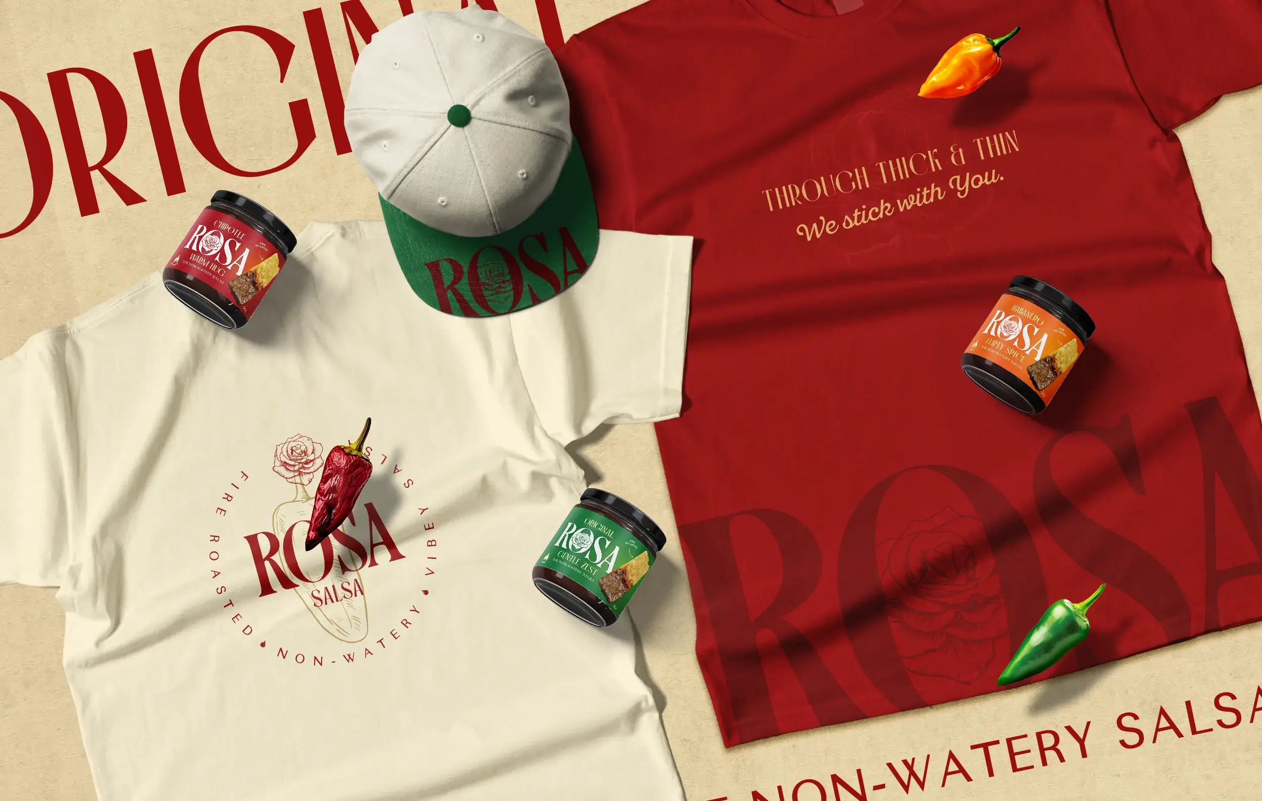
The identity also expanded into branded merchandise, including caps and apparel that brought the Rosa vibe into everyday moments.
For a founder who left a job behind to go all in, the new identity became more than design. It became proof.
The Dope* Experience
Happy Founders
Nick Fenn
Rosa Salsa, Texas
Founder
After working with Rajesh, we are NOT perceived as a cute farmers market company now.
"We had no soul… not in a bad way, but there was no depth or personality to my brand.
Something blowing in the wind, you could say. I wanted to find a designer to give Rosa an actual identity and stand for something.
Rajesh gave us an identity that looks like we are ready for national growth. That kind of shift is huge. It changes how customers see us and how we show up with confidence and THAT is the power of design work from Rajesh.
I feel like I’ve been waiting for this moment for a long time. Knowing our branding was not good, to now being so incredibly confident in it is like no other feeling I’ve had."