
Services
Brand Identity Design
- Brand Logo & Icon Design
- Brand Identity Design
- Packaging Concept & Design
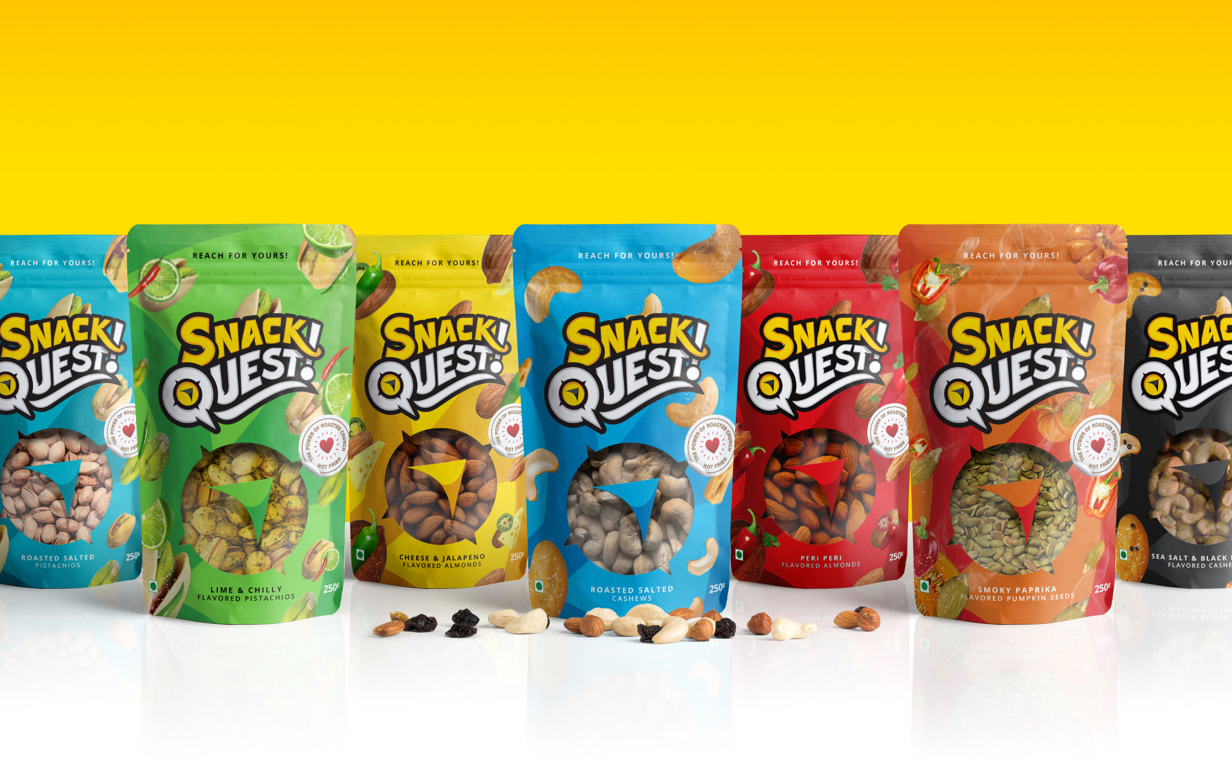
Snack Quest is a brand* of flavored nuts, seeds, and trail mixes that was promoted as an easy, fun, snack for millennials, young working professionals, moms and kids in the competitive Indian FMCG market.
The Deal
Design a kick-ass brand package for healthy snacking - adults and kids, bite-sized.
Design the brand logo to be different and unique in the dry fruit segment.
Choose vibrant colors reflecting mass appeal and product flavors.
No pre-launch ads. Let the package dance with distributors and customers, saying, "I'm the snack you've been searching for."
.jpg)
The Dope* Process
Discovery and Briefing: Uncovering Snack Quest
Aptly named by the Brand's Co-Founder and Brand Strategist, Justin Ancheta Snack Quest embodies freedom, adventure, ambition, and moments of spontaneity and humor.
In the course of visual design research for competitive dry fruit brands both nationally and internationally, we decided to break away from the standard design styles prevalent in the packaged dry fruit industry.
Why confine dry fruit package designs to images of traditional bowls or table settings?
And brand logos reminiscent of bygone richness and elegance?
Instead, why not venture into a direction where dry fruits can be a fun, trendy snack that also serves its intended purpose of being healthy?
Crafting the Logo: A Thoughtful Quest
The quest for healthy design drew inspiration from unexpected places.
The vibrant visual styles of superhero comics and the relentless spirit of sports clubs.
This unique blend symbolizes our common goal: to embark on a journey, evolve into the best versions of ourselves, and make a positive impact on lives.
With Snack Quest, our mission isn't to advocate for drastic lifestyle changes overnight. Instead, we aim to inspire small, daily decisions toward a healthier lifestyle.
.jpg)
The Dynamic Sporty Superhero influence
Drawing from the visual brand design of superhero comics and sports clubs, our logo embodies boldness and dynamism.
The customized typography/font style evokes the image of a flying flag, symbolizing progress and energy as one embarks on their journey.
.jpg)
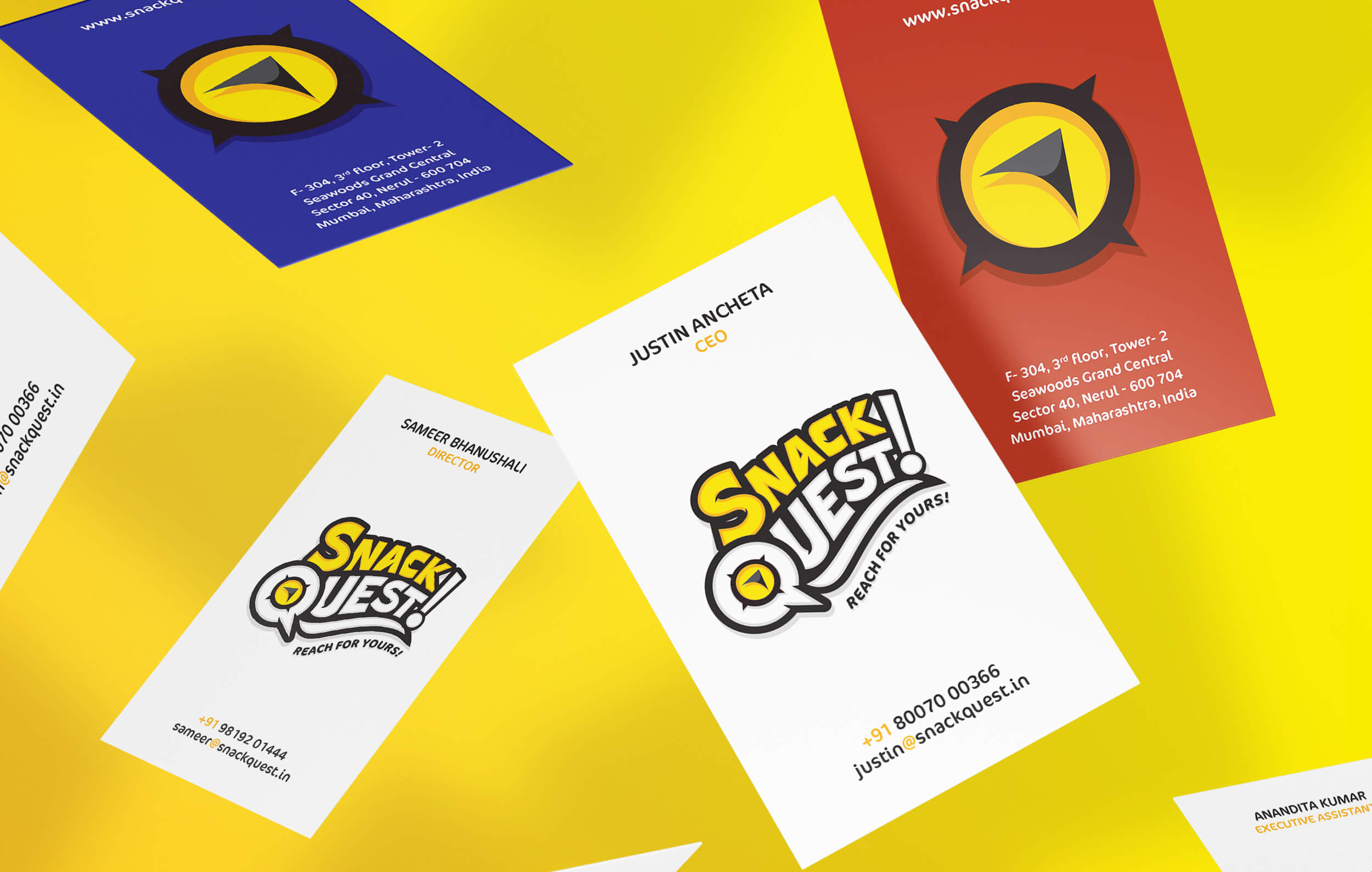
The Iconic Compass: Navigating Direction
At the heart of our logo lies a deeper symbolism – a representation of embarking on a personal quest.
Nestled within the white space of the Letter Q, is a compass icon.
It serves as a constant companion on any quest, offering a sense of focused direction amidst challenges and uncertainties.
The upward-pointing arrow within our logo signifies growth and purpose.
Facing forward towards the typography, it subtly reinforces the intent of our quest and brand, emphasizing the journey toward healthier snacking choices.
_1.jpg)
Colorful Quest: Infusing Energy into Snack Quest
Yellow isn't just the color of the sun; it's the dawn of new beginnings.
It's the SNACK label standing out on shelves, symbolizing our commitment to wholesome snacking.
It's also within the compass icon, guiding us on a journey toward healthier choices.
Blank slate, Bold borders
In QUEST, white signifies the blank canvas of our journey. It's about embracing new experiences, learning, and growth.
With bold black borders, we assert our strength and authority in the market, standing tall as a brand that means business.
Together it can hold any color within the compass as an abstract way of saying - it's strong for whatever quest one chooses to take.
Vibrant Hues: Telling Flavorful Stories
Our packs burst with color, each shade reflecting the essence of our snacks.
Blues for Almonds, Cashew, and Pistachios—they're not just flavors; they're stories waiting to be savored.
It's how we stand out and stay memorable.
The Dope* Experience
Happy Founders

Justin Ancheta
Snack Quest
Co-Founder, Entrepreneur
The visualization of Snack Quest is still one of my favorite brands that I have personally worked on.
"Rajesh was able to capture deep archetypal components of the human psyche and translate them into a seamless visual brand experience.
He was able to contribute to our strategic thinking in a big way which is the ability to take 'logical' market insights and combine them with a deep intuitive design sensibility. We absolutely loved the custom typography and logo imagery that we knew was unique in our space. Working with Rajesh was a pleasure in many ways as we hold our brands in the highest regard.
We recommend his work above creative firms as we found his strategic skills, intuitive design, communication, and professionalism to be exceptional in every way."
_1.jpg)
Quest Evolution: An abrupt end with a twist
My design quest ends abruptly yet with a surprising twist. Commissioned by Ashapura Agrocomm Private Limited to diversify into India's retail snack segment, the showcased package design concepts feature the approved Snack Quest brand logo, marking the culmination of our collaborative efforts.
However, Justin had a strong intuition that the name would create unforeseen issues for copyright and scalability.
Amidst our renewed brand strategy research, this unexpected turn led to the exciting birth of Bazana! Healthy Roasted Snacks
This unforeseen twist underscores the dynamic nature of branding and the importance of adaptability in the ever-evolving competitive FMCG market landscape.
_1.jpg)