Services
Brand Identity Design
- Brand Logo & Identity Design
- 5 Book Cover designs
- Inner Page Template designs
- Responsive Website Design
The Let's Evolve project, initiated by authors Nehha Lohiya and Veena Verma, marks the inception of a brand centered around the series launch of five insightful and thought-provoking books.
These books, aiming to guide readers towards their best lives, delve deep into various aspects of human existence, embodying a journey of self-revelation and growth.
.webp)
The Deal
Craft a standout brand logo and identity that truly embodies Let's Evolve's essence and the heart of the five captivating books.
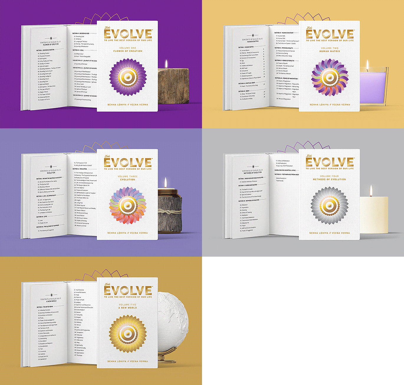
Design visually striking book covers that not only grab attention but also reflect the profound themes woven into each volume.
Build a responsive brand website, serving as the one-stop destination for Let's Evolve enthusiasts, offering insights into the books, authors, and the brand's deep-rooted mission.
 copy_1.webp)
The Dope* Process
Exploring Spiritual Insights: A Journey through Discovery Calls
In our discovery calls and meetings, Nehha, Veena, and I delved into ancient wisdom and spirituality.
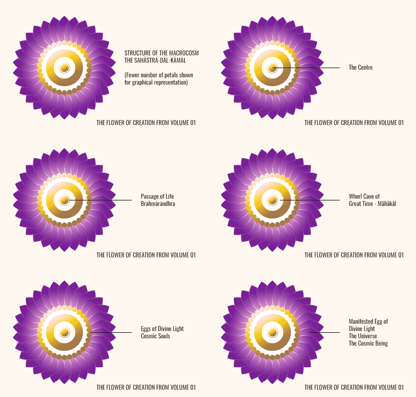
Through our discussions, guided by their research, we uncovered the profound significance of the 'Flower of Creation' and the mesmerizing purple and golden hues.
Sacred Imagery: The Flower of Creation's Role Across the Series
At Let's Evolve's core lies the 'Flower of Creation', a thousand-petal lotus embodying existence's essence.
Rooted in Vedic literature as Sahastra-dal-kamal, its circles symbolize creation's stages, with purple representing divine light and gold signifying illumination's center.
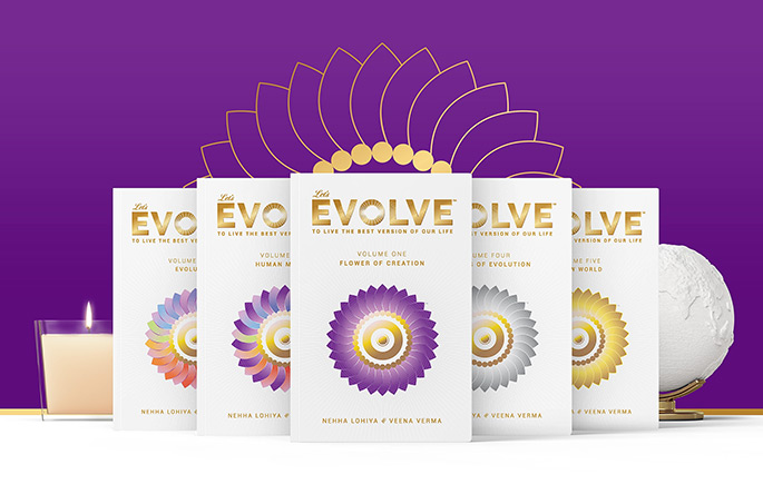
Given its profound significance, we prominently retain the Flower of Creation on all book covers as the series' central theme.
Brand Evolution: From 'Evolve' to 'Let's Evolve'
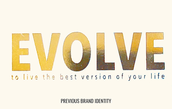
In our quest to revamp the brand, we transitioned from the simple yet profound 'Evolve' to the more engaging and inclusive 'Let's Evolve.'
This shift not only personalized the brand but also invited readers to join us on a transformative journey.
Versatile Design: Ensuring Brand visibility across media
We recognized the importance of a typographical logo that stands out amidst the clutter of bookshelves and digital platforms.
Delving into the heart of the word 'Evolve' we sought to encapsulate its essence in our logo, ensuring its adaptability across various media channels.
Capturing the Essence: Symbolism behind the Logo
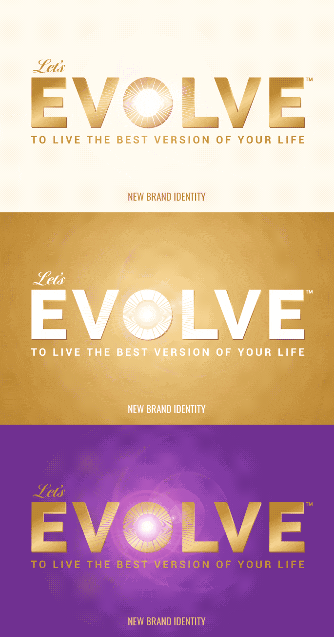
Crafted with a bold typeface and strategic design element, Let's Evolve's brand logo design evokes feelings of growth, optimism, and enlightenment.
The rays radiating from the letter 'O' symbolize new beginnings and personal transformation, echoing the essence of the big bang, the soul's spark, and the sun's rays.
To enhance visibility and meaning, we chose to highlight it in metallic gold in print formats or gradient gold for digital media.
This typographic logo design meets the client's preference, ensuring clarity and consistency across all brand communications.
 copy.webp)
Harmonizing Book Covers: Creating Unity Through Patterns
Centered around the symbolic 'Flower of Creation', our book cover design strategy is aimed at cohesion and distinction.
By fusing rainbow colors with the brand colors of purple and gold in different patterns within the flower, each volume's cover was made unique yet cohesive with the series.
This approach not only captured the essence of the books but also ensured uniformity across the series.
Additionally, we developed a design template for the internal chapters of the books, ensuring consistency and ease of replication throughout the series.
Brand Identity Extension: Stationary and Beyond
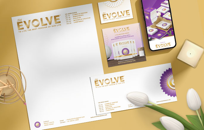
With the logo finalized, we extended the brand identity to essential stationary items such as letterheads and envelopes in print and digital formats.
To provide readers with a comprehensive brand experience, we curated identity accessories including a hardbound sleeve to hold all five volumes, a custom canvas bag, bookmarks, and a journal for writing.
These accessories complemented the books and enriched the overall brand journey for readers.
Engage and Enlighten: Crafting an Engaging Website Experience
In the course of redesigning the book covers, the design language for the brand was clear. We wanted to give the viewer a unique visual experience visiting the website.
This was definitely not going to be an academic website.
The Let's Evolve website seamlessly integrates the symbolic 'Flower of Life' motif across its pages, echoing its spiritual significance and vibrant colors as detailed in Volume 01 of the series.
Each book has its dedicated page featuring a synopsis, topic lists, images, and global reader reviews. This concise yet informative layout aimed to capture visitors' interest and encourage exploration.
Visitors can also explore individual author pages to connect with the creators behind the series, enriching their Let's Evolve journey.
 copy.webp)
Enlightening Choices: Spiritual Tones and Flexible Purchases
The website utilized spiritually significant colors like purple, gold, and white, fostering a sense of transformation and enlightenment.
Its user-friendly layout, inspired by e-commerce platforms, simplified navigation and minimized confusion.
Offering varied purchase options, visitors could choose between printed books with global shipping or eKindle versions.
This adaptable approach catered to different preferences, ensuring accessibility and convenience for all globally.
 copy.webp)
The Dope* Impact
Creative Thinking: Let's Evolve's Design Process
Our visual design strategy and creative design approach, particularly the innovative use of colors and patterns to represent each book's themes within the flower of creation, resonated strongly with Nehha and Veena, fostering deep appreciation for our work.
-copy.jpg)
-copy.jpg)
 copy.webp)
Driving Engagement: Let's Evolve's Impactful Brand Journey
The brand website served as a powerful tool for engaging readers and generating sales.
The Brand identity language was used to create social media templates and designs by the marketing team that enhanced audience engagement and interest in the brand.
That's evolution in a way too, isn't it?
www.letsevolvebookseries.com


.gif)

