
Services
Brand Identity Design
- Brand Logomark design
- Brand Stationary design
- Responsive Web design
Shailendar Chhugani is a fashion designer known for his luxurious jalabiyas and kaftans, crafted for boutiques across US, UK, Dubai, Saudi Arabia, the wider Middle East and several African markets.
After 30 years of building his name through craftsmanship alone, he was ready for a digital presence that matched his reputation.
What began as a website request evolved into a complete brand identity built around his personal name - the one his industry already trusted.
The Deal
Build a Brand logo and identity using his personal name.
Design a rich colour system rooted in his fabrics and finishes
Develop packaging and stationery for global reach
Create a custom website experience that feels premium, not template driven
The Dope Process
A designer who thrives for decades without a website isn’t behind the times - he’s simply depended on the strength of his craft and global relationships.
By the time he approached me, he had already supplied to boutiques across the GCC and earned a reputation for ornate embroidery, fine fabrics and luxurious details.
The digital identity needed to honour that depth of work.
Having a brand identity as its foundation was key.
Finding the Core Idea
I began by studying his audience, competitors and the broader Middle Eastern fashion landscape. The segment has its own rhythm being expressive, symbolic and rich in detail.
Western fashion brands may get away with minimalism, but here, culture lives in texture.
Embroidery, gold accents, calligraphy and the crescent moon stood out as recurring design anchors.
These gave me a visual vocabulary to build a brand that felt authentic without becoming cliché.
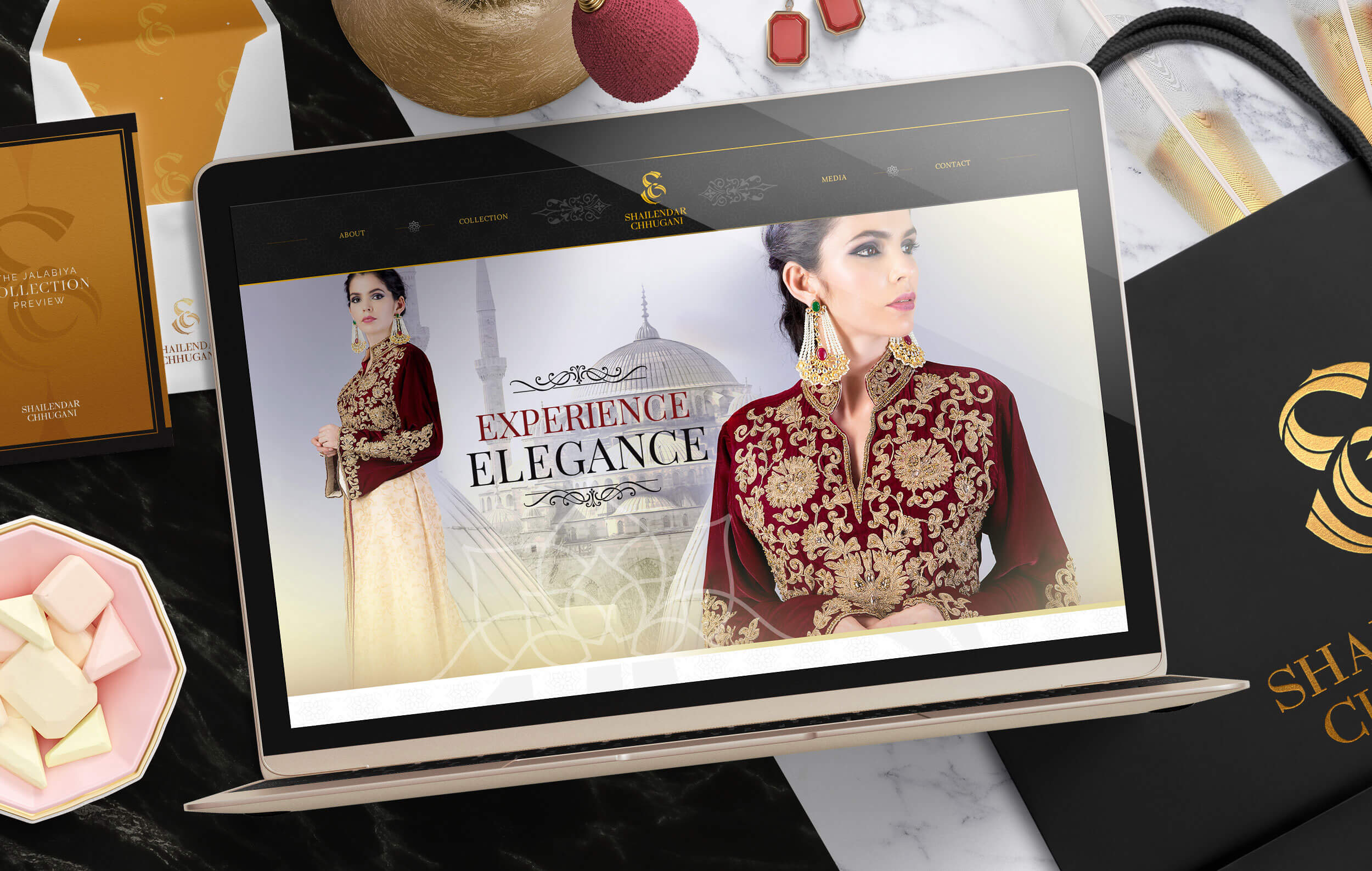
Designing the Brand Logo
His initials, S and C, became the foundation of the identity.
The S stands tall and bold, symbolising Shailendar ~ the individual behind the craft.
The C sits within the S, representing the family name at the centre of his legacy.
Its curved shape also mirrors the crescent moon, a subtle nod to womanhood and Middle Eastern tradition.
The result was an ornate mark that spoke the language of both heritage and modern luxury.
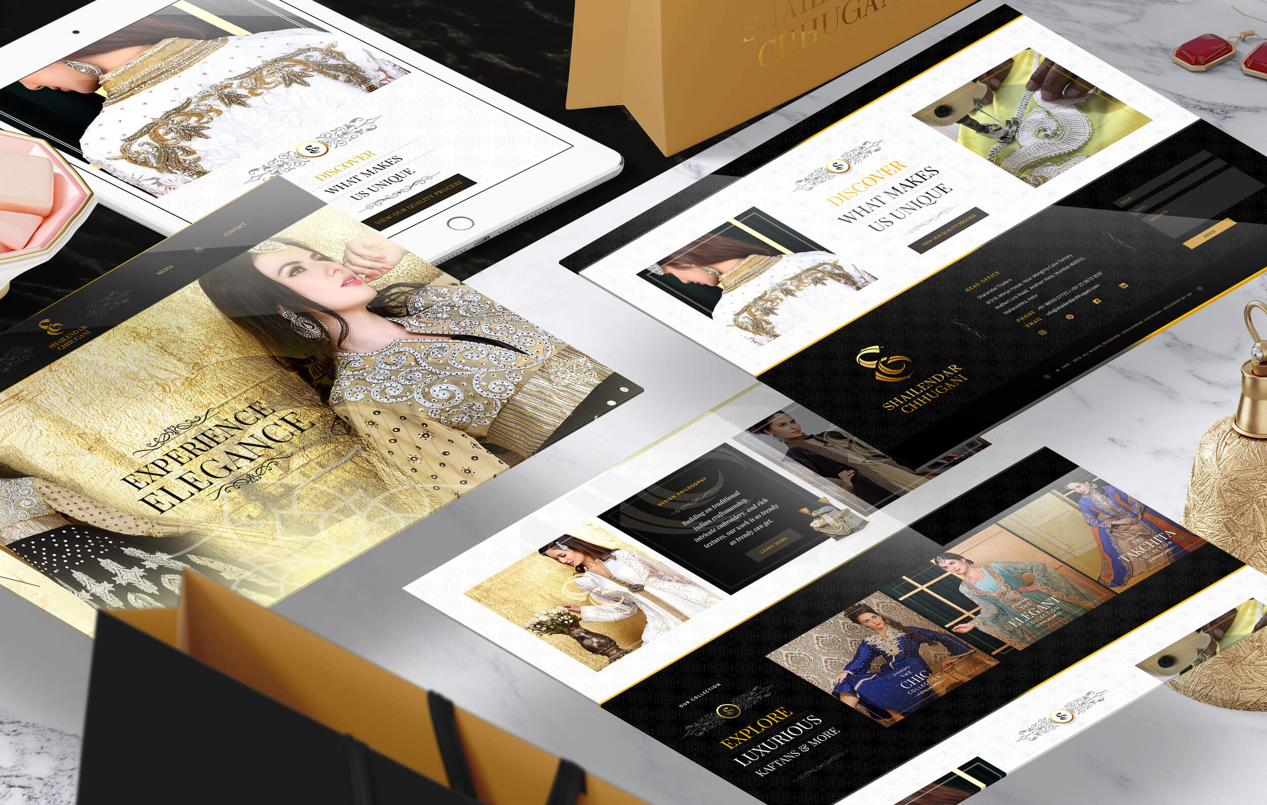
Designing the Colour System
Gold for richness.
Black for grounding.
Deep maroon, rich green and royal blue drawn from the fabrics he often uses such as velvets, silks, chiffons and ornate embroidered textiles.
The palette wasn’t invented; it already lived in his garments.
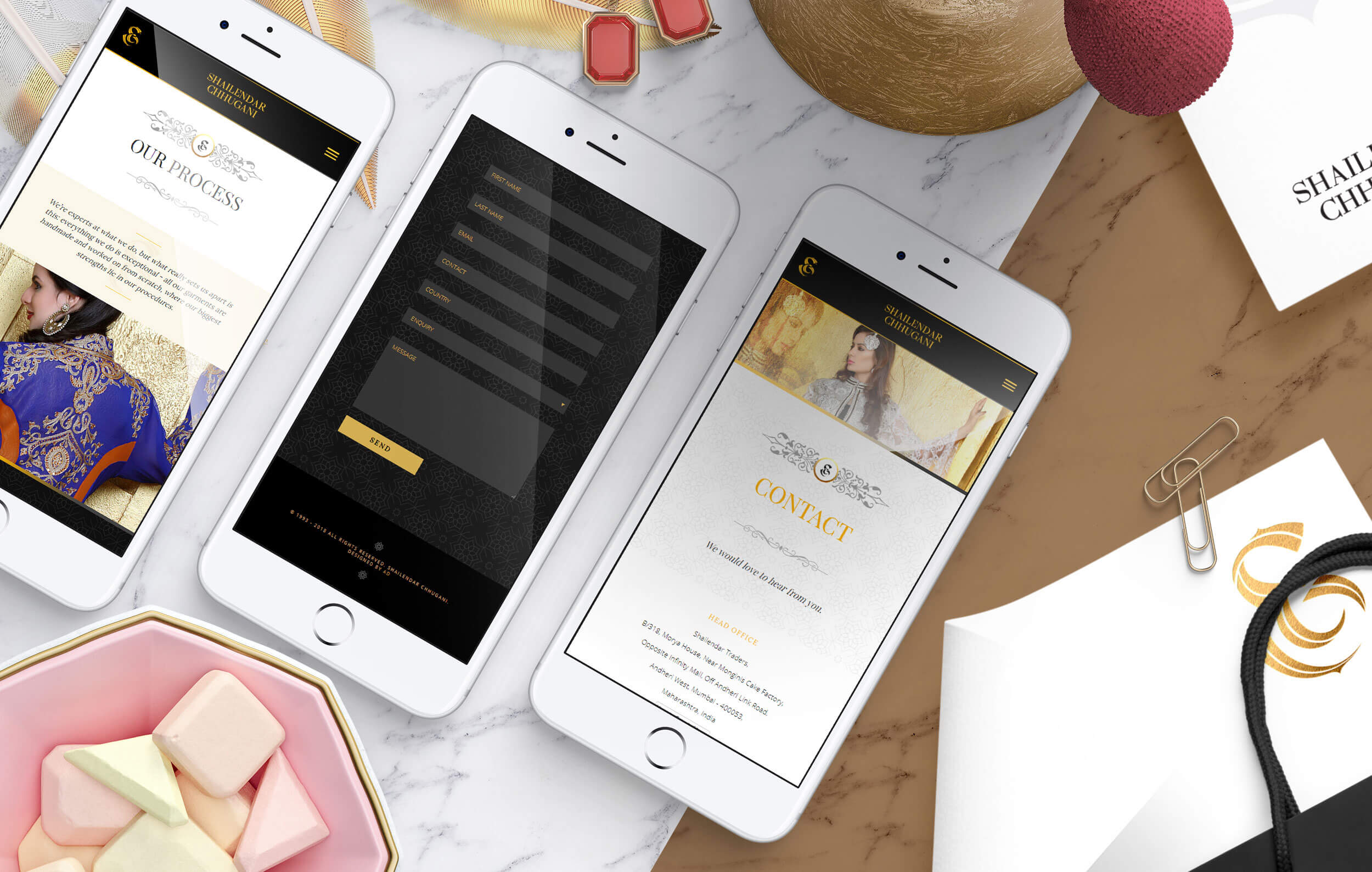
Extending the Identity
The ornate theme translated across every touchpoint:
business cards, letterheads, envelopes, garment tags, boutique bags and signage.
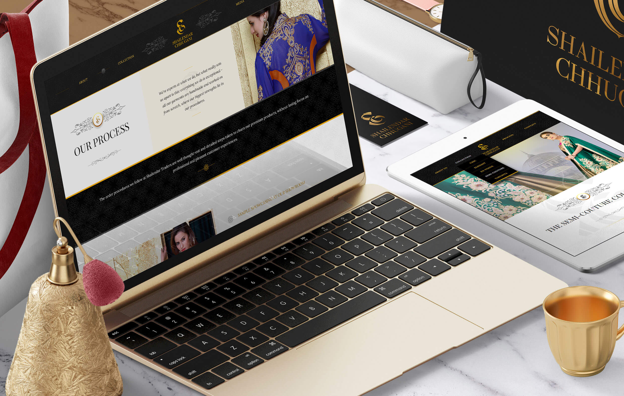
For the responsive website, the Middle Eastern digital space offered an unexpected opportunity.
Most competitor sites leaned on simple e-commerce templates with minimal design.
That gap allowed me to create a more textured, luxurious experience ~ one that reflected the craftsmanship he is known for, from hand embroidery to intricate printing and aari work.
We designed ornate background tiles, layered motifs and a warm visual hierarchy so his garments could be displayed like pieces of couture rather than catalogue items.
It became the first true digital expression of his 25-year journey.
The Dope Impact
For the first time in his career, Shailendar had a complete brand identity and a polished digital presence that matched the quality of his work.
The transformation elevated his legacy, strengthened his international stature and opened him up to a new wave of global clients.
Sometimes the glow-up comes late.
In this case, it arrived exactly when the brand was ready.